%20rotate(-45)'/%3e%3cpath%20class='cls-1'%20d='M96.14,33.17c-3.35-1.35-7.06,1.83-7.21,5.13-.19,2.04,1.2,4.14,2.91,6.01,2.04,2.25,4.4,4.48,5.7,7.24,2.36,4.82,1.48,10.81-2.26,15.12-2.04,2.39-4.92,4.15-7.97,4.78-2.86.65-5.81-.02-8.4,1.48-2.26,1.27-4.31,3.65-6.46,5.79-2.5,2.54-4.02,4.72-3.57,7.25.39,2.58,2.6,4.84,5.23,5.08,4.64.16,7.27-4.77,10.88-7.2,1.42-1.07,2.94-1.86,4.65-2.34,3.79-1.1,7.98-.23,11.25,1.97,1.18.78,2.24,1.58,3.15,2,2.09,1.09,3.29-.66,4.03-2.5,6.19-15.07,2.91-34.6-7.91-46.75-1.08-1.23-2.4-2.44-3.88-3.02l-.16-.06.02.02Z'/%3e%3cpath%20class='cls-1'%20d='M41.93,97.93c5.85-6.95-5.61-11.73-7.4-17.99-2.58-6.48.75-14.24,6.87-17.47,3.73-2.45,8.37-.97,12.2-2.9,2.15-1.22,4.02-3.36,5.81-5.13,2.46-2.5,4.29-4.49,4.27-6.87.08-4.02-4.48-7.66-8.24-5.52-2.82,1.45-5.18,4.61-7.94,6.6-6.37,4.79-13.03,2.87-18.83-1.54-2.52-1.49-3.78,1.02-4.55,3.11-2.67,7.12-3.53,15.57-2.25,23.43.49,7.08,11.03,32.4,19.93,24.42l.13-.13h0Z'/%3e%3cpath%20class='cls-1'%20d='M34.5,41.91c6.88,5.83,11.77-5.41,17.89-7.32,6.5-2.7,14.38.62,17.64,6.8,2.44,3.73.97,8.37,2.9,12.2,1.22,2.15,3.36,4.02,5.13,5.81,2.5,2.46,4.49,4.3,6.87,4.27,4.1.08,7.73-4.63,5.44-8.4-1.53-2.81-4.68-5.18-6.63-7.93-4.69-6.36-2.68-12.86,1.63-18.64,1.52-2.56-.97-3.81-3.09-4.59-7.11-2.67-15.57-3.53-23.43-2.25-7.11.5-32.26,10.96-24.49,19.91l.12.12.02.02Z'/%3e%3cpath%20class='cls-1'%20d='M97.93,90.57c-6.95-5.85-11.73,5.61-17.99,7.4-6.31,2.54-14.02-.65-17.31-6.52-2.62-3.81-1.1-8.59-3.06-12.54-1.21-2.16-3.36-4.03-5.13-5.82-2.73-2.7-4.86-4.6-7.53-4.24-5.52.89-7.32,6.64-3.09,10.75,2.34,2.64,5.08,5.01,6.46,8.12,2.76,5.84.3,11.3-3.16,16.06-1.52,2.56.96,3.81,3.08,4.59,7.12,2.67,15.57,3.53,23.44,2.25,7.08-.49,32.4-11.03,24.42-19.93l-.13-.13h0Z'/%3e%3c/svg%3e)
Bowlpros
One year inside an Italian food brand. First I brought order to what was there, then I rewrote the rules.
In one year: 150+ projects delivered, 36 guideline boards, 5 retail chains and channels and 1 visual language holding them together.
The journey
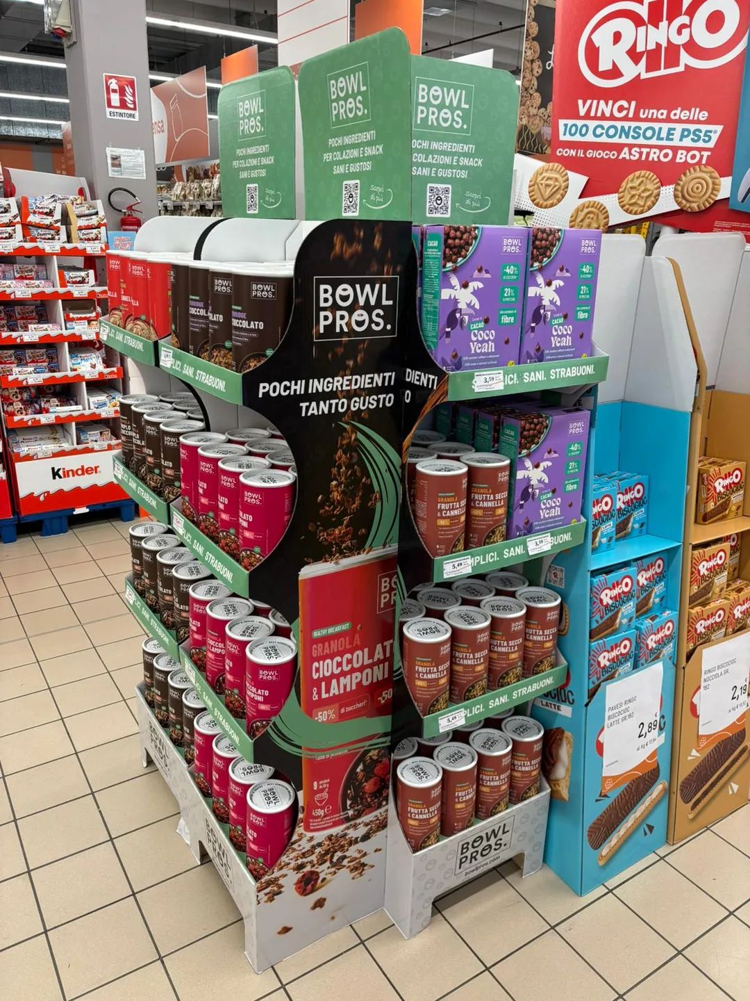
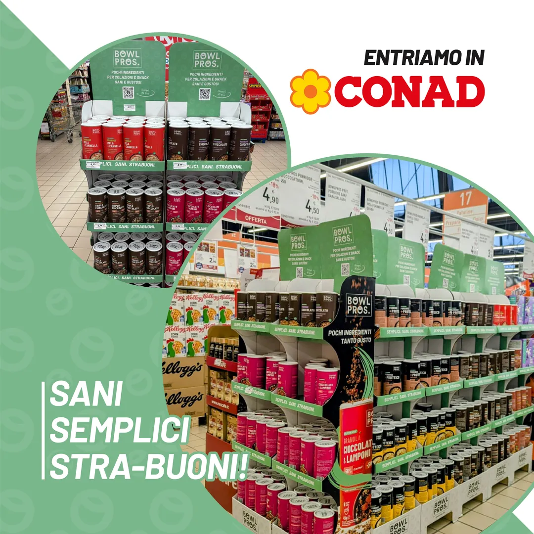
I join Bowlpros. First project: the floor display for Conad.
Special Edition: Tiramisù, Sacher and Babà. The leaflet for the boxes.
Seasonal hero banners, site icons, new packs.
The Keto line is born: granola, bar and spread, with its own light blue.
The displays reach Conad stores.
Labels revised for retail and e-commerce, Solo 3 Ingredienti line, 3D shelves.
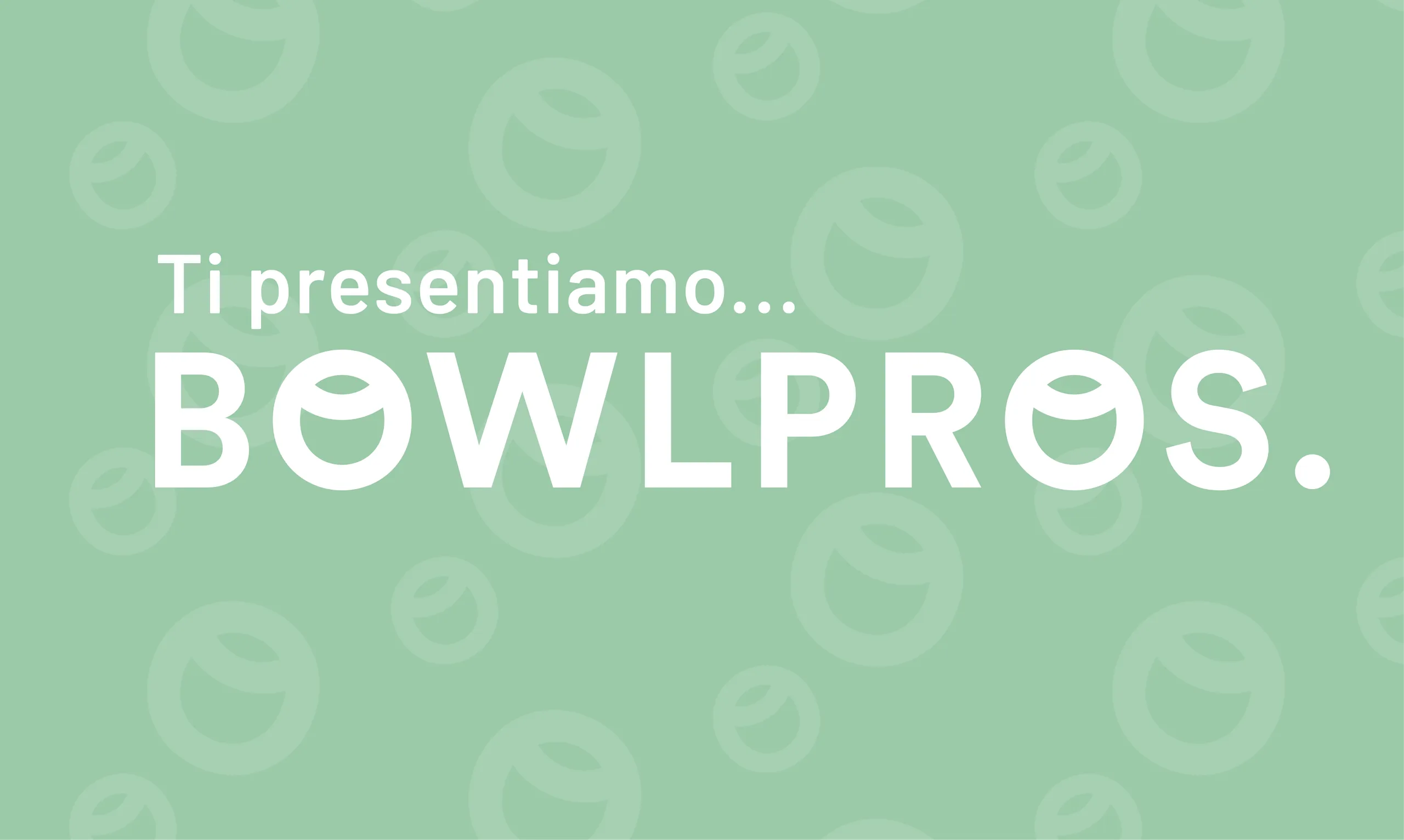
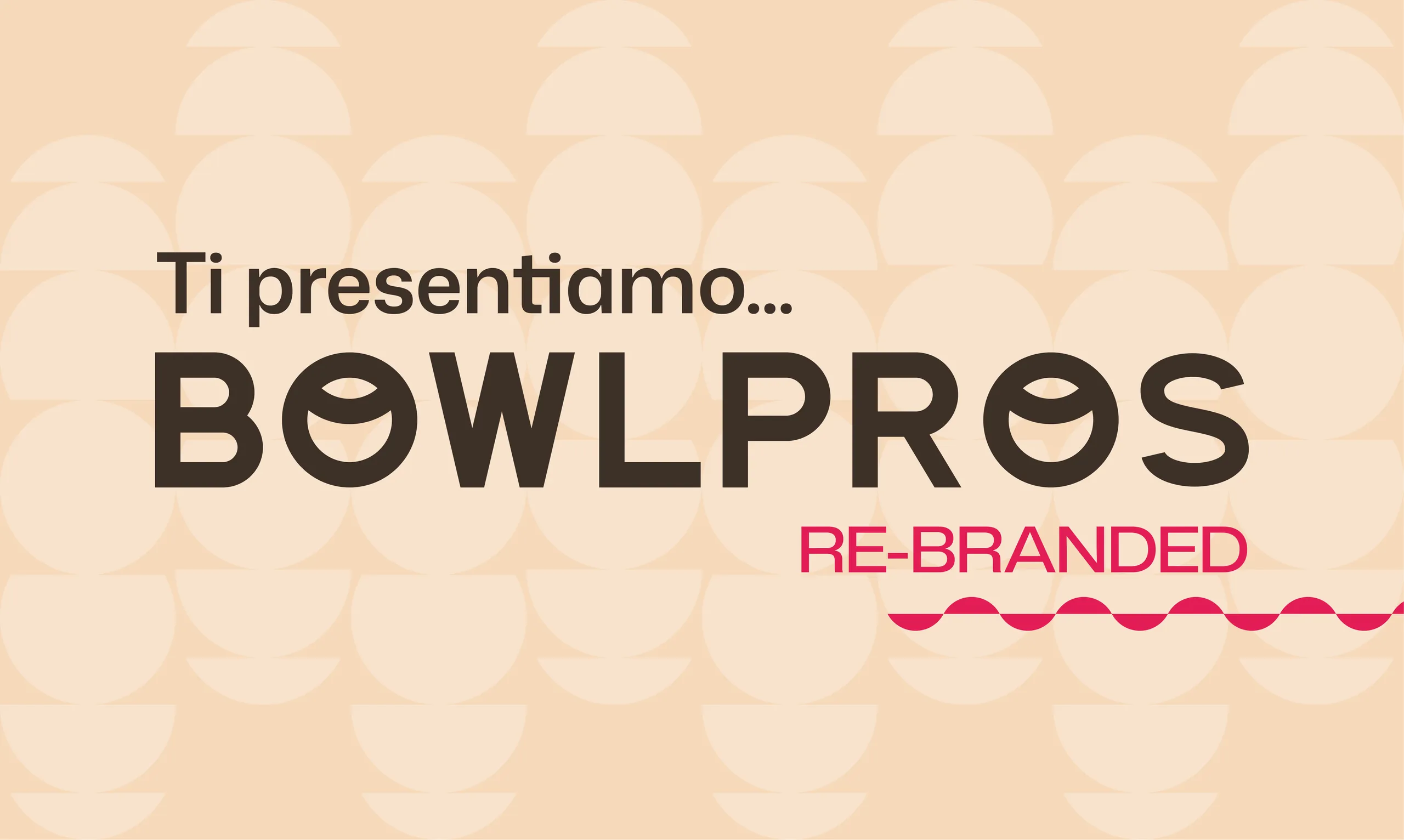
I present the rebrand.
The new identity goes live: site, campaigns, displays, labels.
One brand, three languages
When I arrived, Bowlpros spoke through its categories: green for Healthy products, dark grey for Protein. Each line had its own world and the brand stayed in the background.
- Healthy
#7AB78B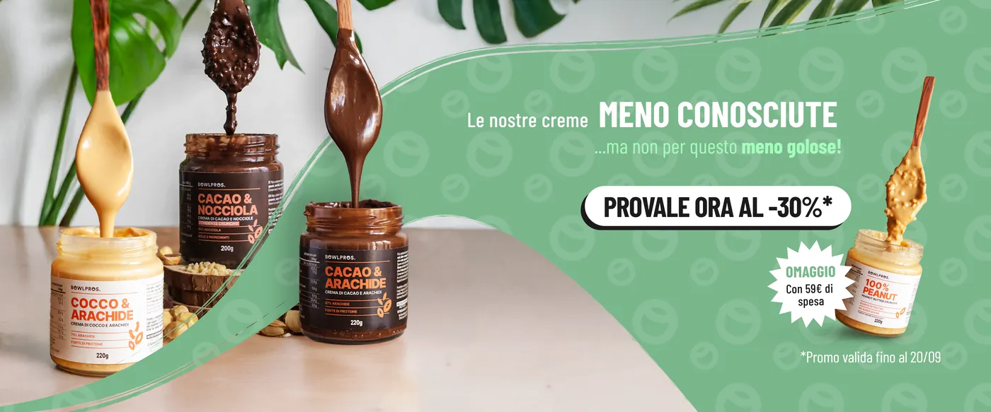
- Protein
#1C1B1B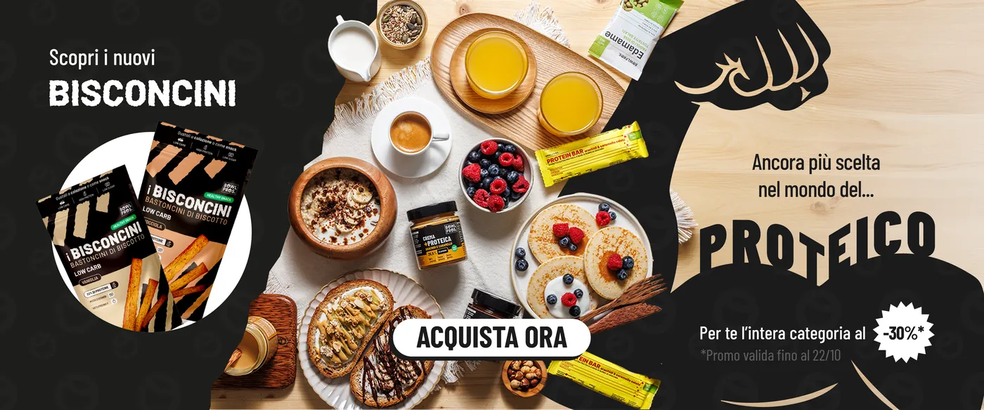
- Keto
#74BEAD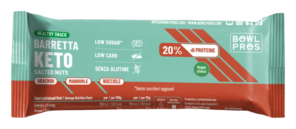
New line · Oct 2025
I spent the first year making what existed consistent, inside an identity I hadn’t chosen: same margins, same hierarchy, same way of presenting the product on every format. The Keto line was born in those months too, and with it its light blue: a third category colour, chosen before the rebrand.
Special Edition
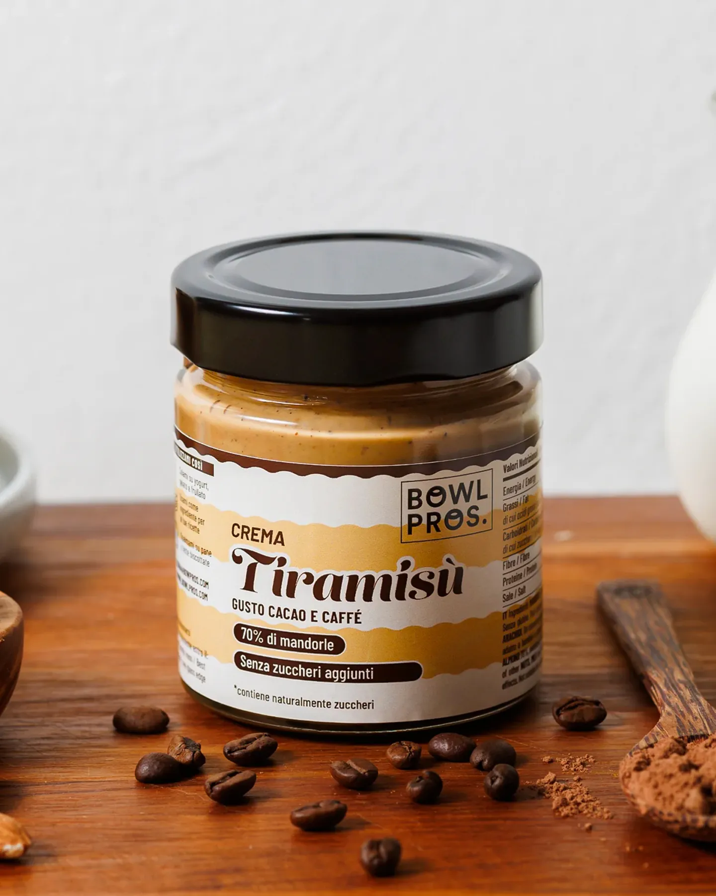
I reworked the Special Edition line starting from a typographic study. The Lust serif brings a fine-pastry tone; the formal contrast with the brand’s corporate sans, Barlow, keeps elegance and legibility together.
The dessert inside the label
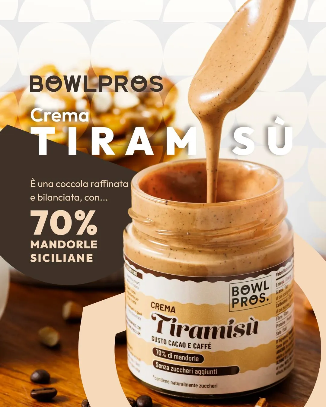
For the Tiramisù spread, one of the best sellers, the label layout stylises the dessert’s iconic layers: you recognise it on the shelf before reading the name.
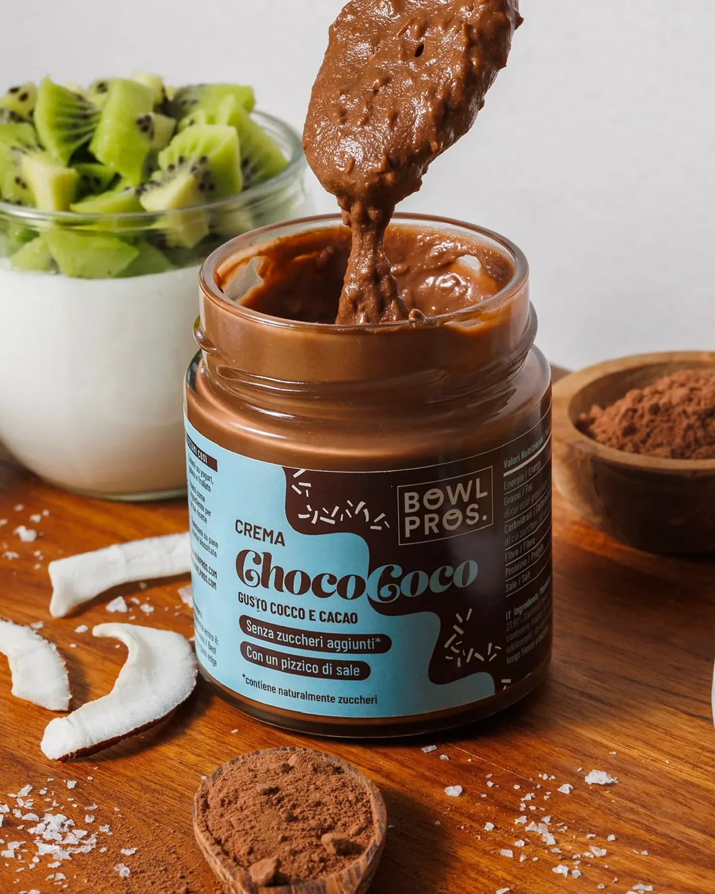
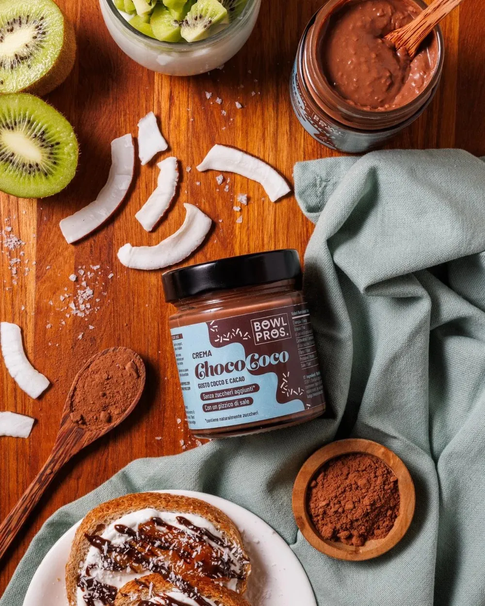
For ChocoCoco the brief asked to tell the product’s dual nature. I turned it into a colour contrast: coconut blue against deep cocoa brown.
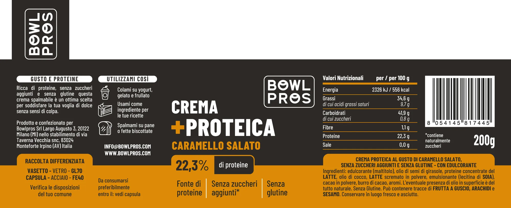
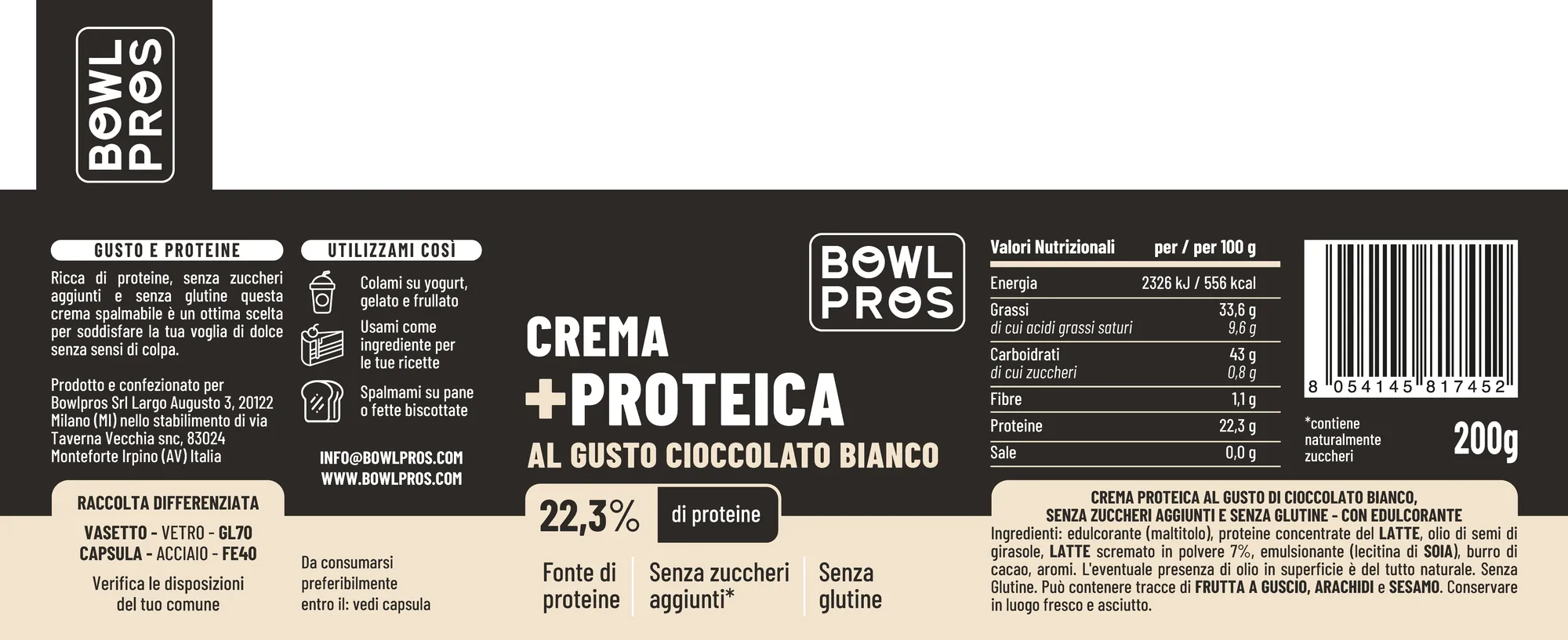
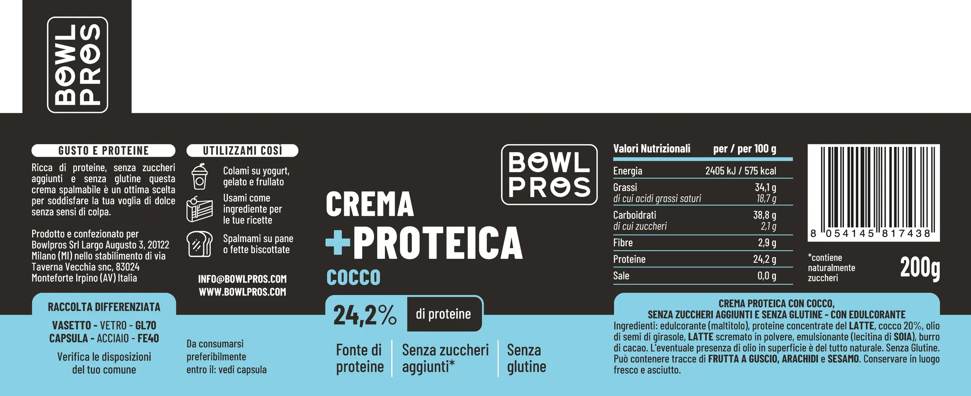
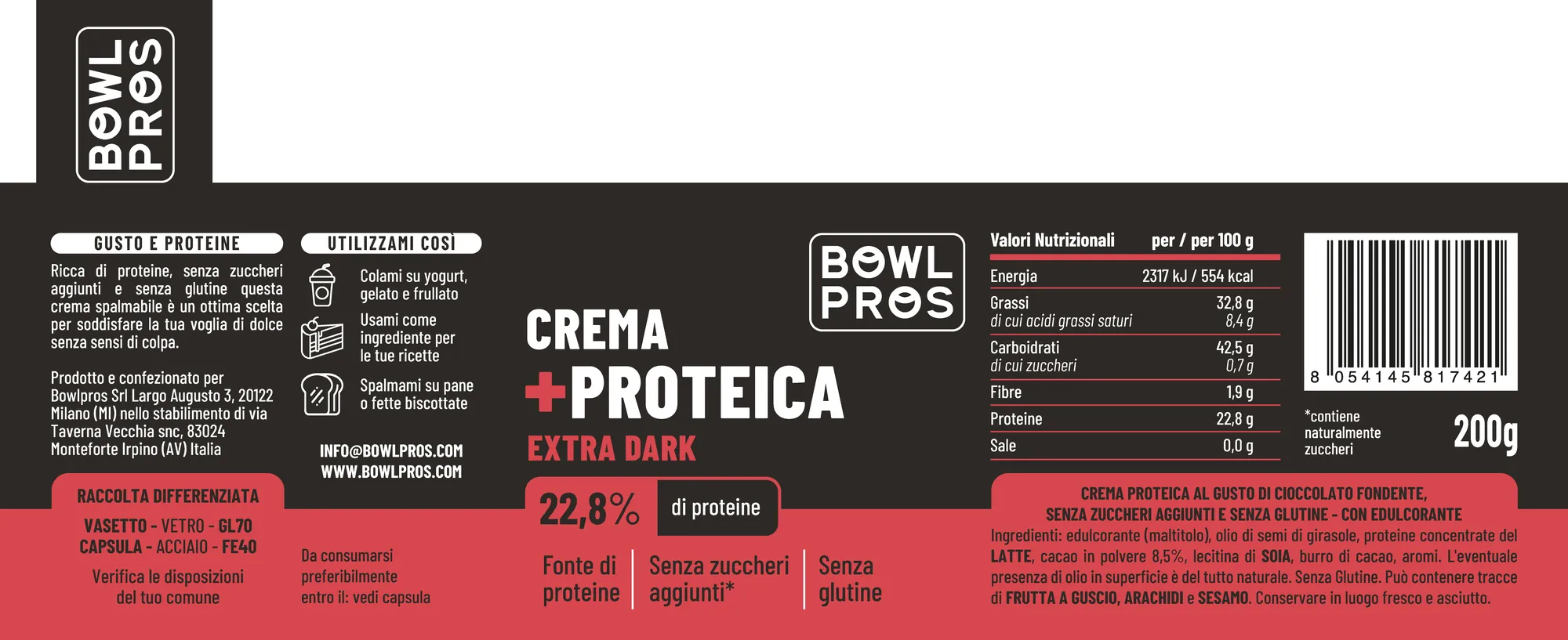
One layout, one colour per flavour
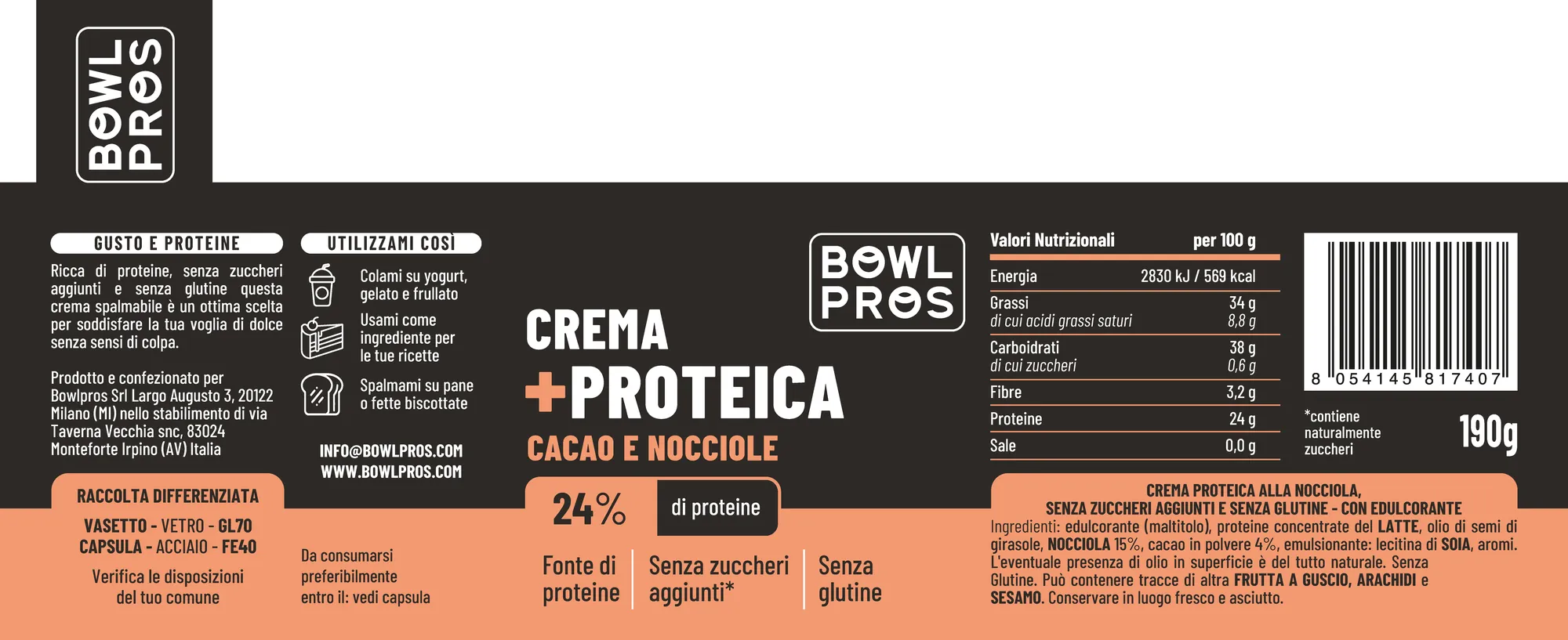
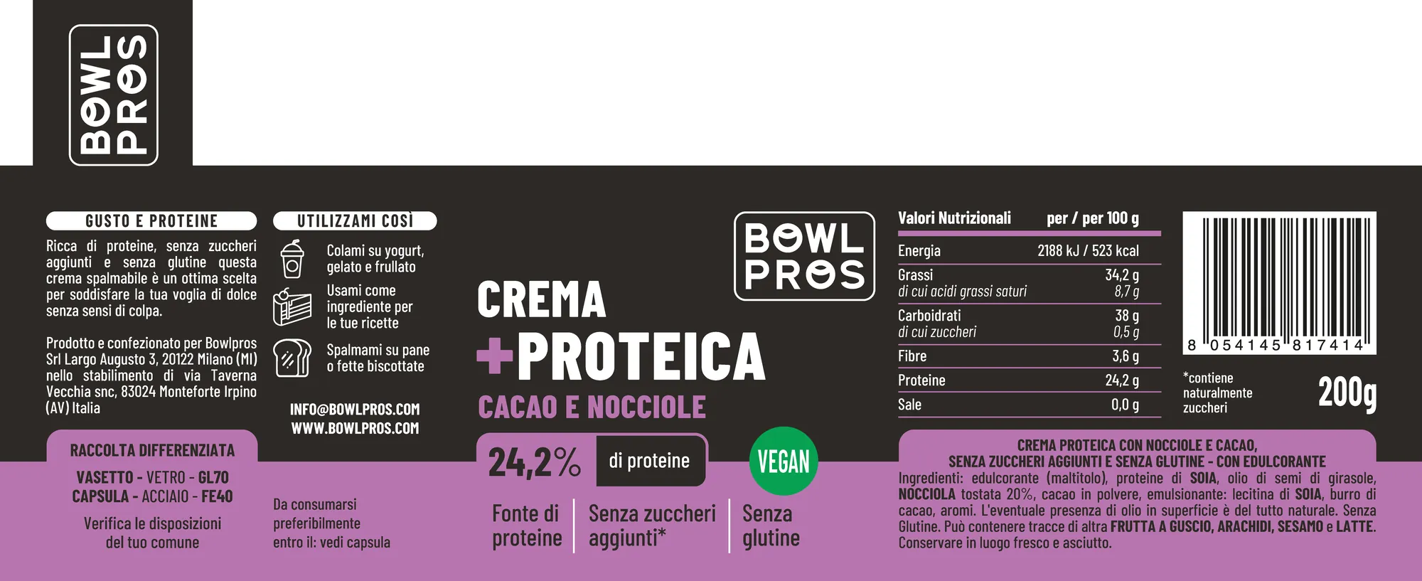
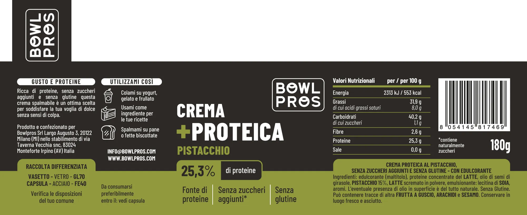
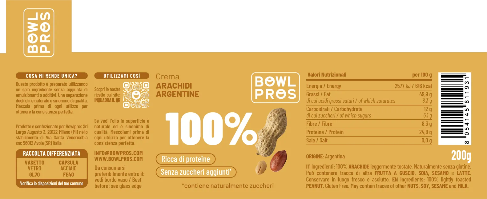
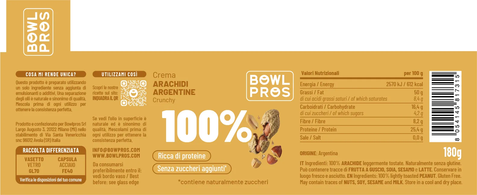
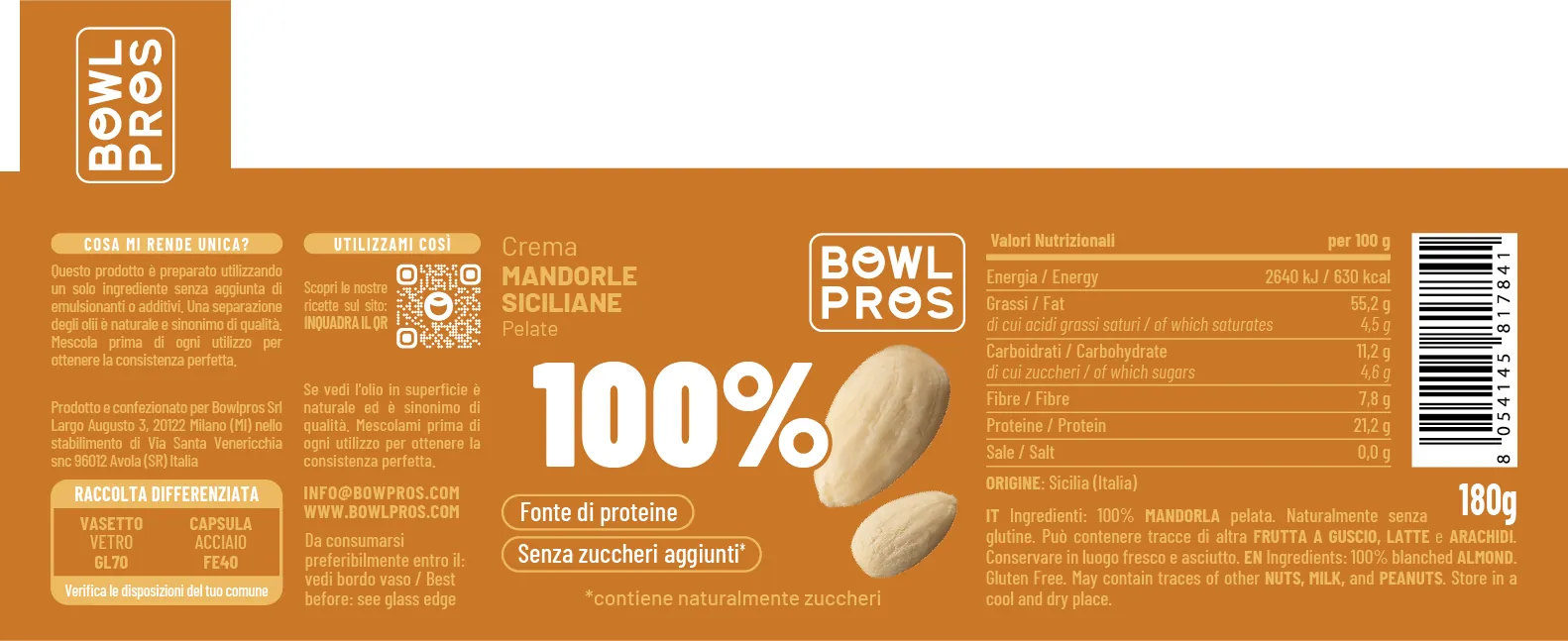
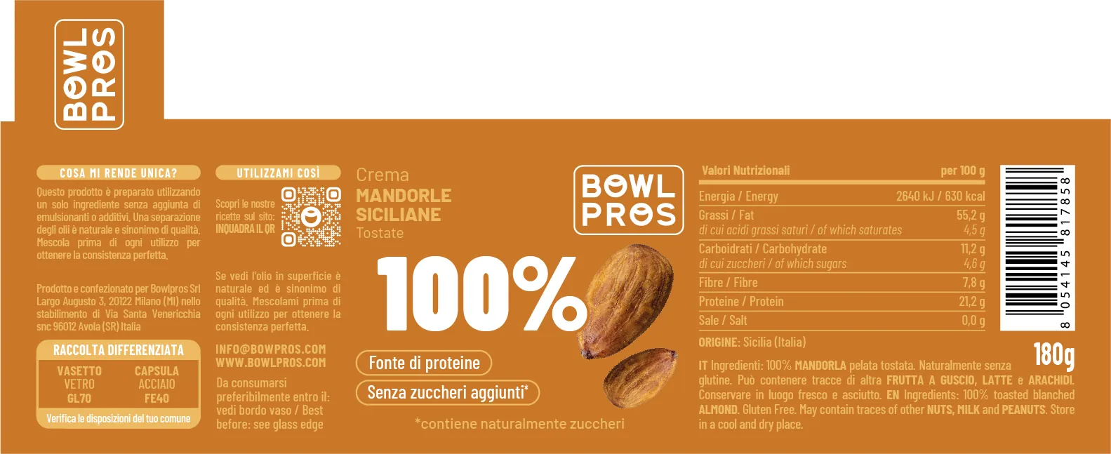
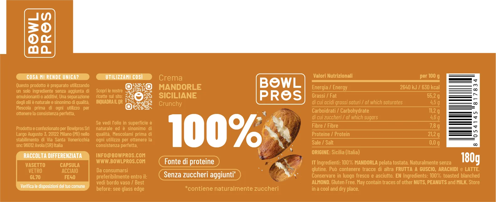
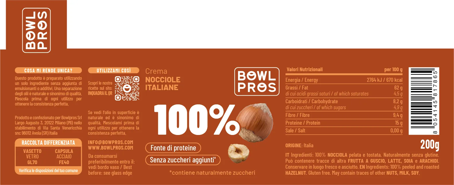
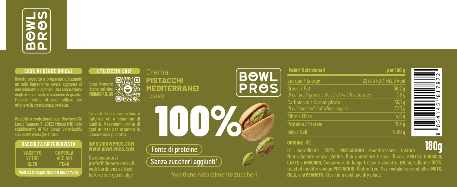
Between November 2025 and February 2026 I revised the labels of every line, for retail and e-commerce. Each family has one layout: the colour changes, everything else is always in the same place.
Protein spreads · 180–200 g
100% nut butters · 180–200 g
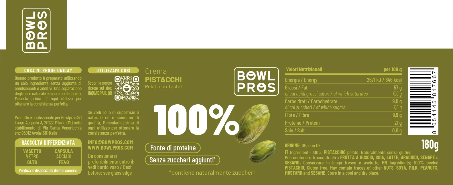
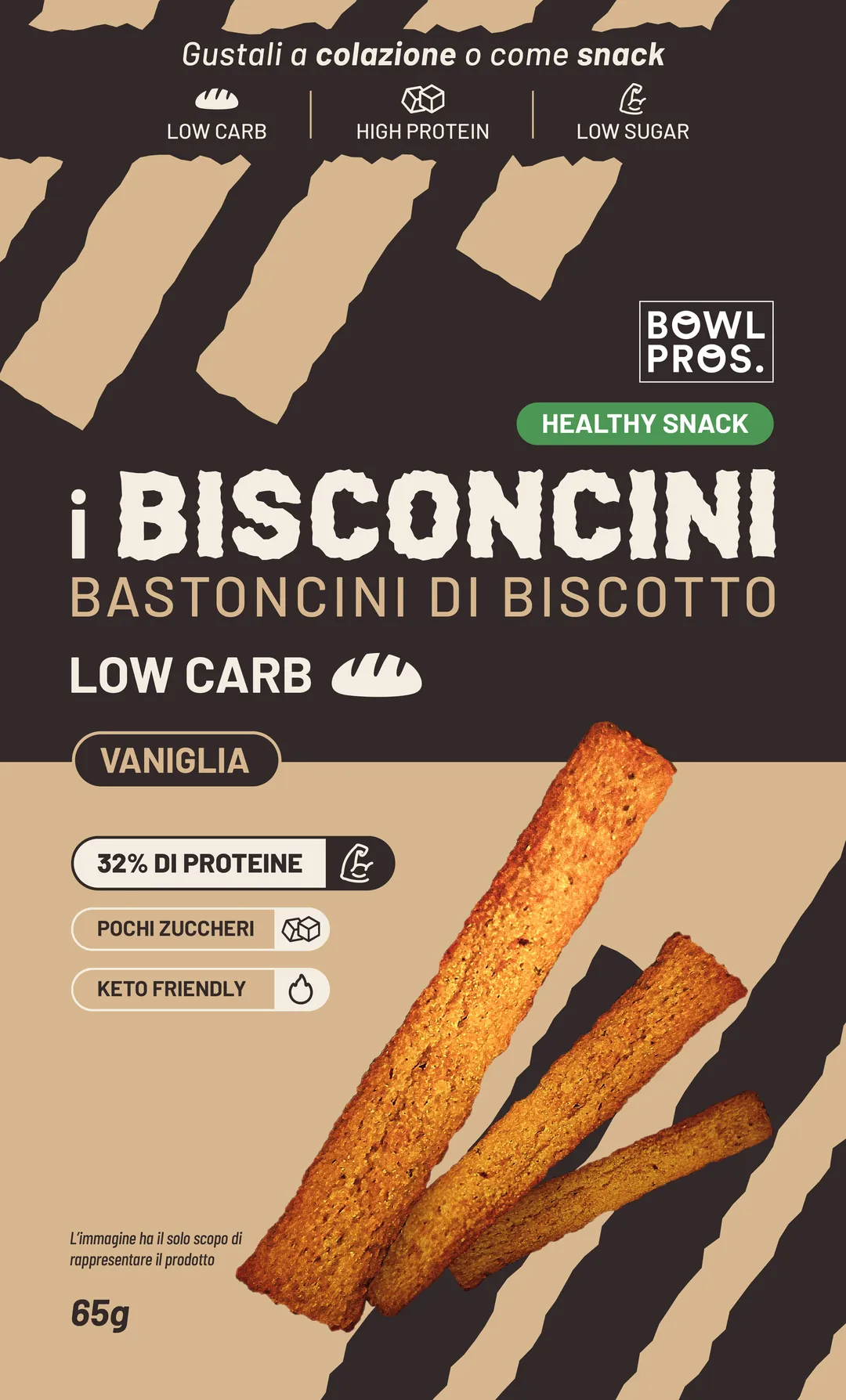
From die-line to print
For Bisconcini, low-carb biscuit sticks, I followed the box from start to finish: die-line, artwork, corrections, print-ready files.
The shelf
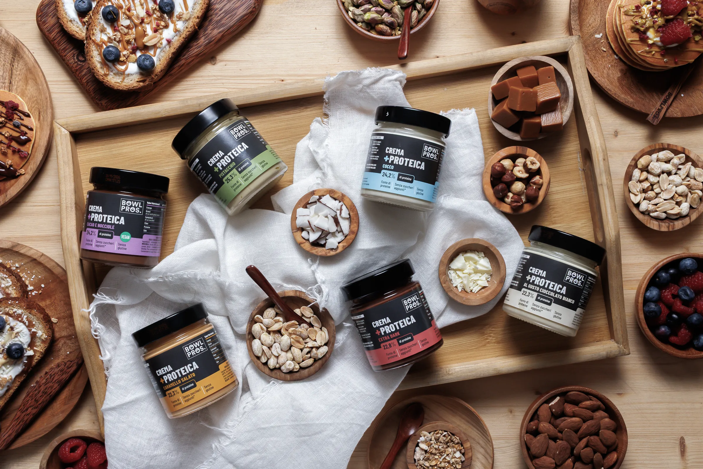
Spreads, compotes, granolas, cereals, snacks and bars: every product crossed my desk, from the label to the 3D mockup for e-commerce and buyer presentations. Here are the latest mockups, made consistent: same light, same shadow.
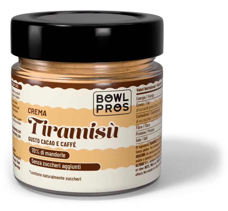
Tiramisù
Special Edition
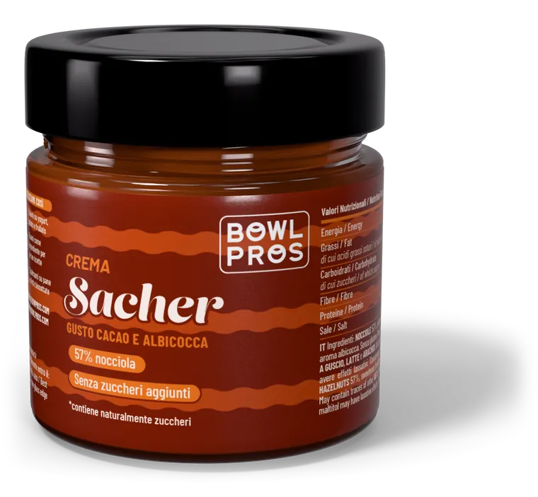
Sacher
Special Edition
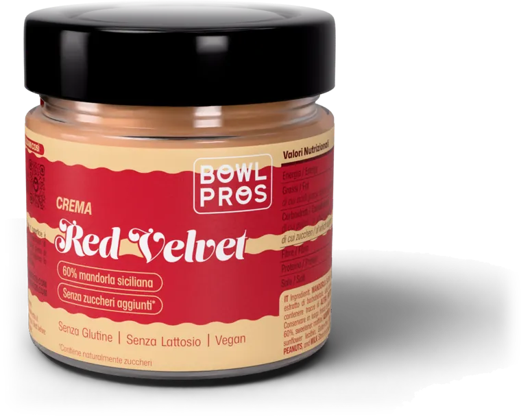
Red Velvet
Special Edition
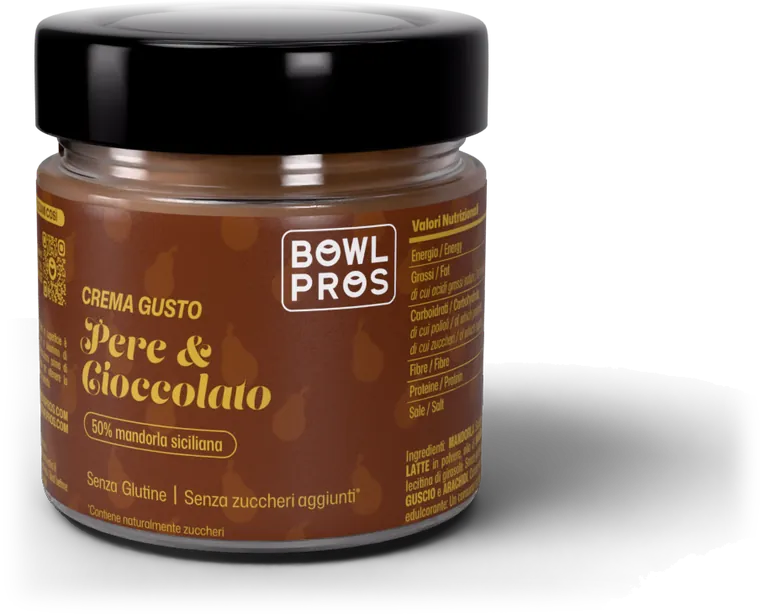
Pear & chocolate
Special Edition
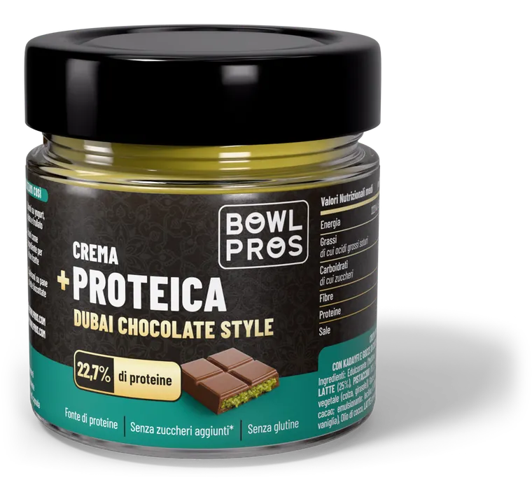
Dubai protein spread
Protein
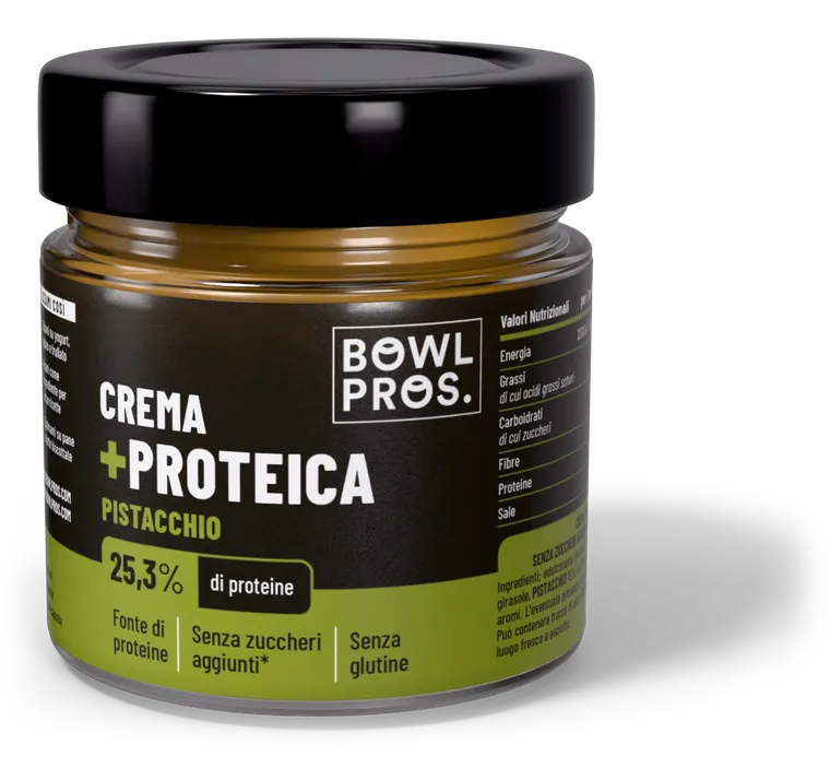
Pistachio protein spread
Protein
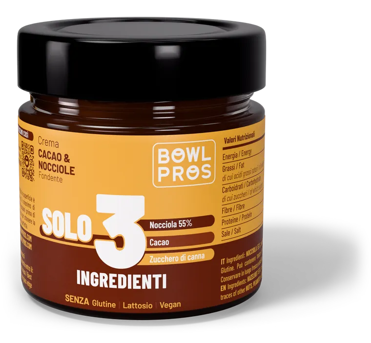
Cocoa & hazelnut
Solo 3 Ingredienti
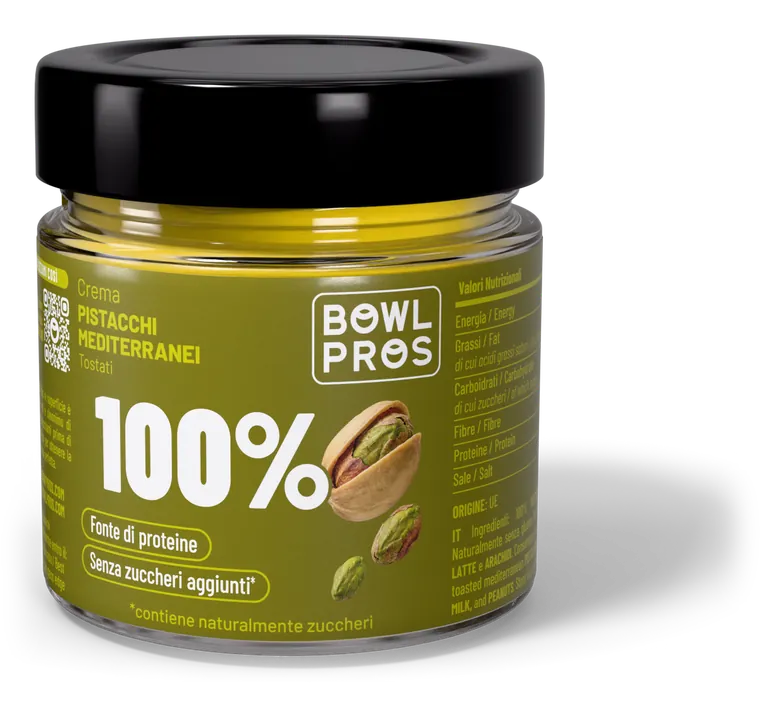
Pistachio
100%
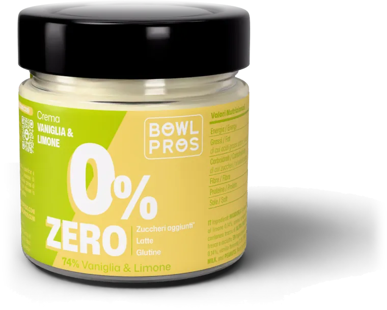
Vanilla & lemon
Zero
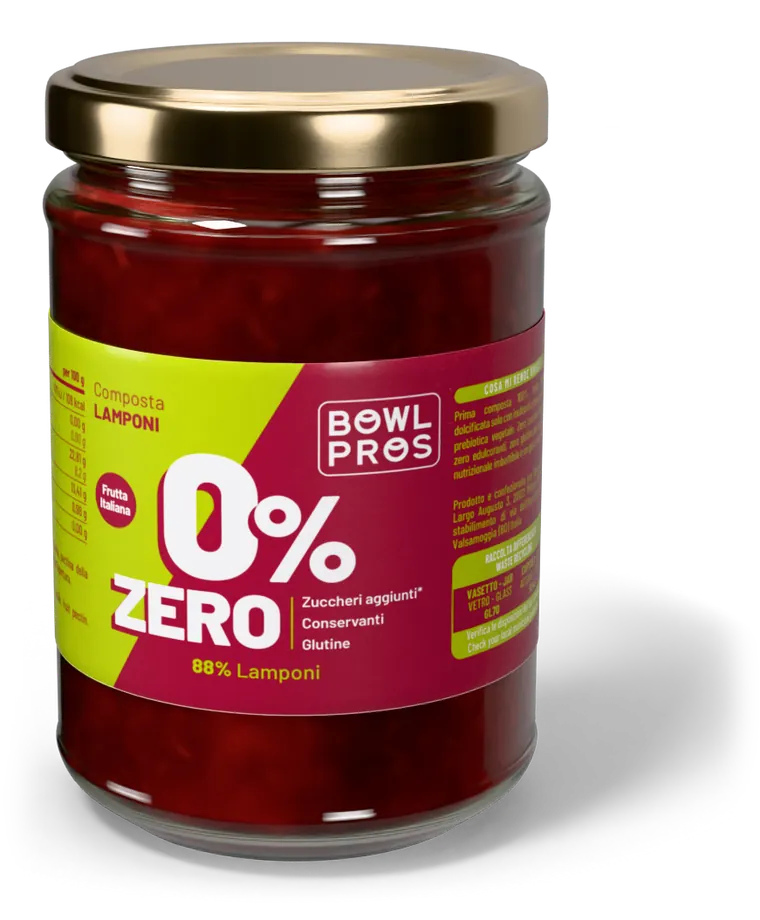
Raspberry compote
Zero
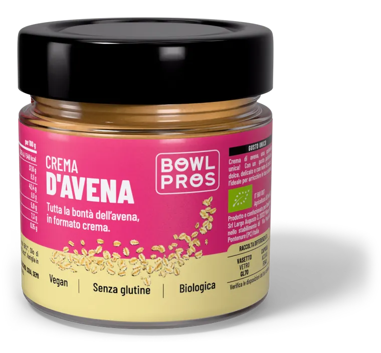
Oat spread
Organic
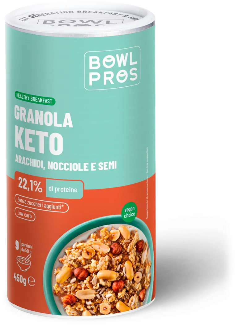
Granola Keto
Keto
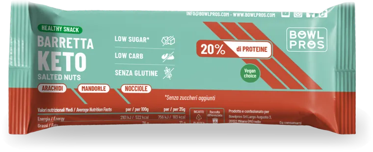
Keto bar
Keto
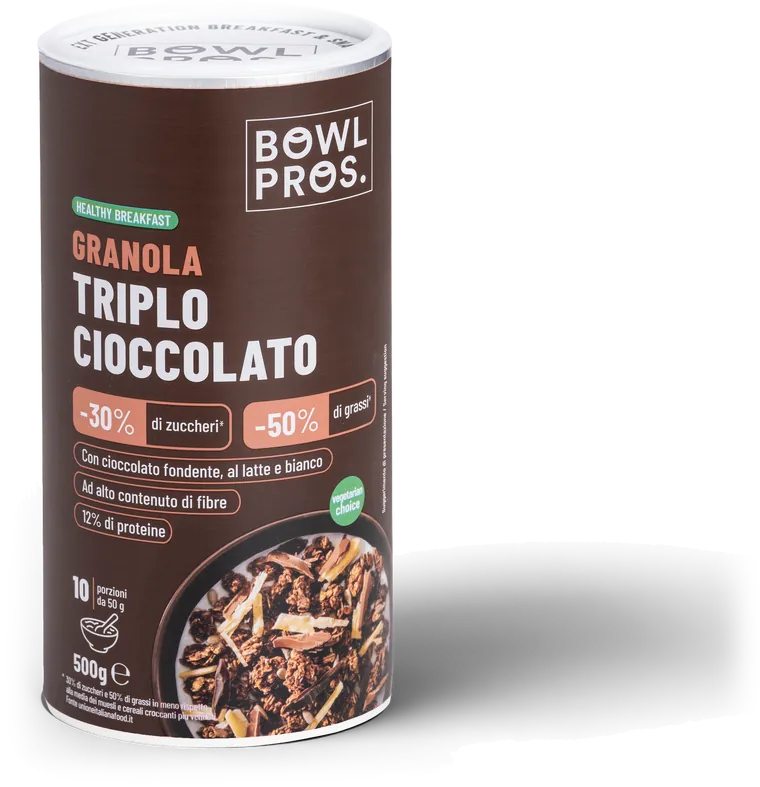
Triple chocolate granola
Healthy
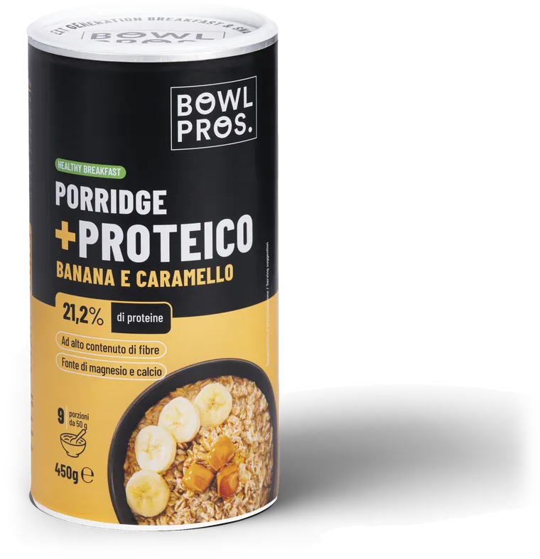
Banana & caramel porridge
Protein
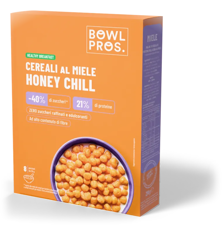
Honey Chill
Healthy
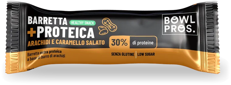
Peanut & caramel bar
Protein
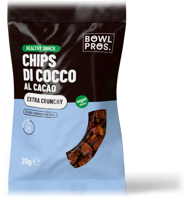
Coconut chips
Snack
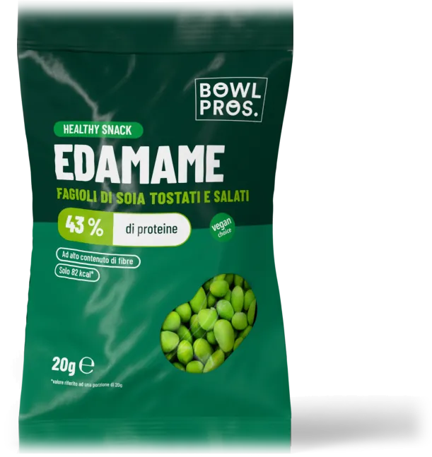
Edamame
Snack
From screen to shelf
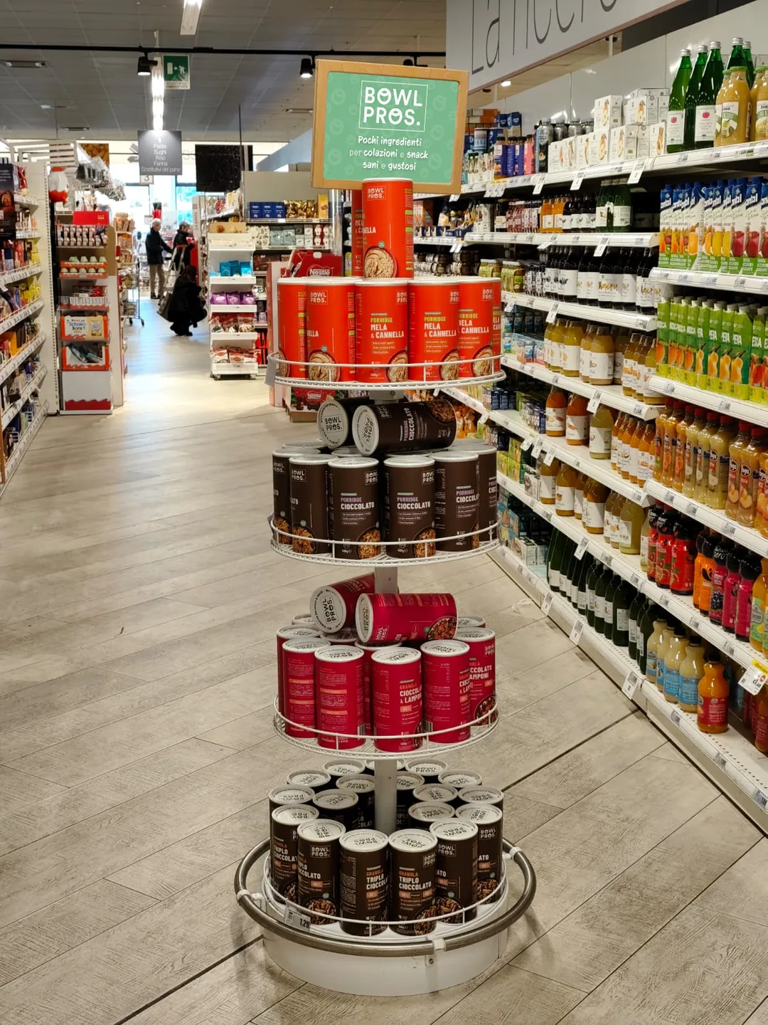
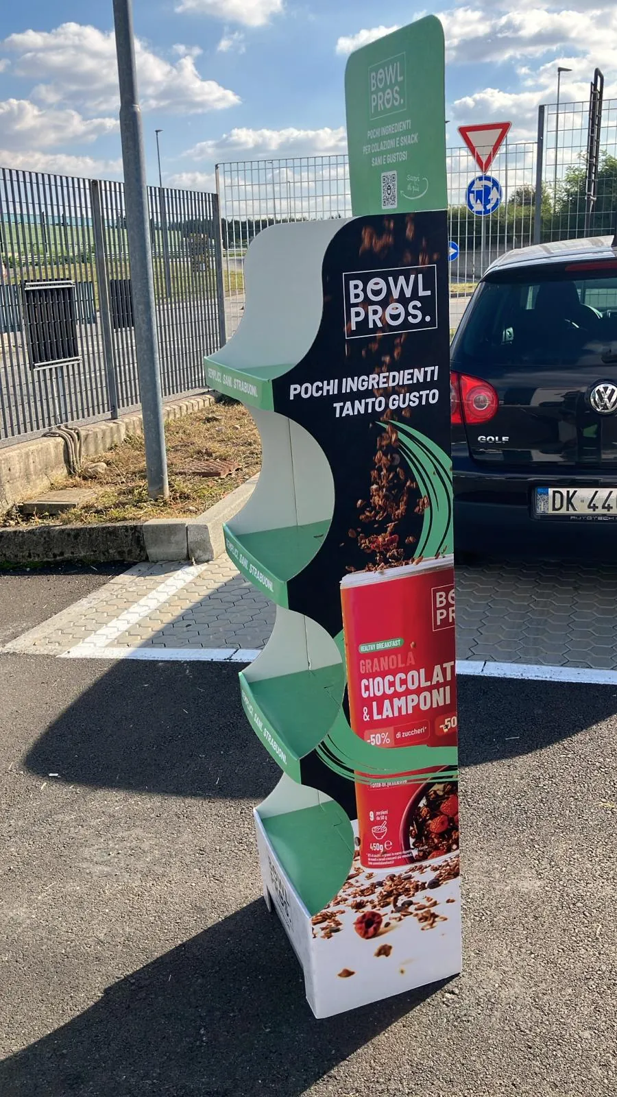
I designed the graphics for the floor displays and crowners rolled out in Conad stores across Italy, starting from the 3D model used to present them before printing.
The shelf before the shelf
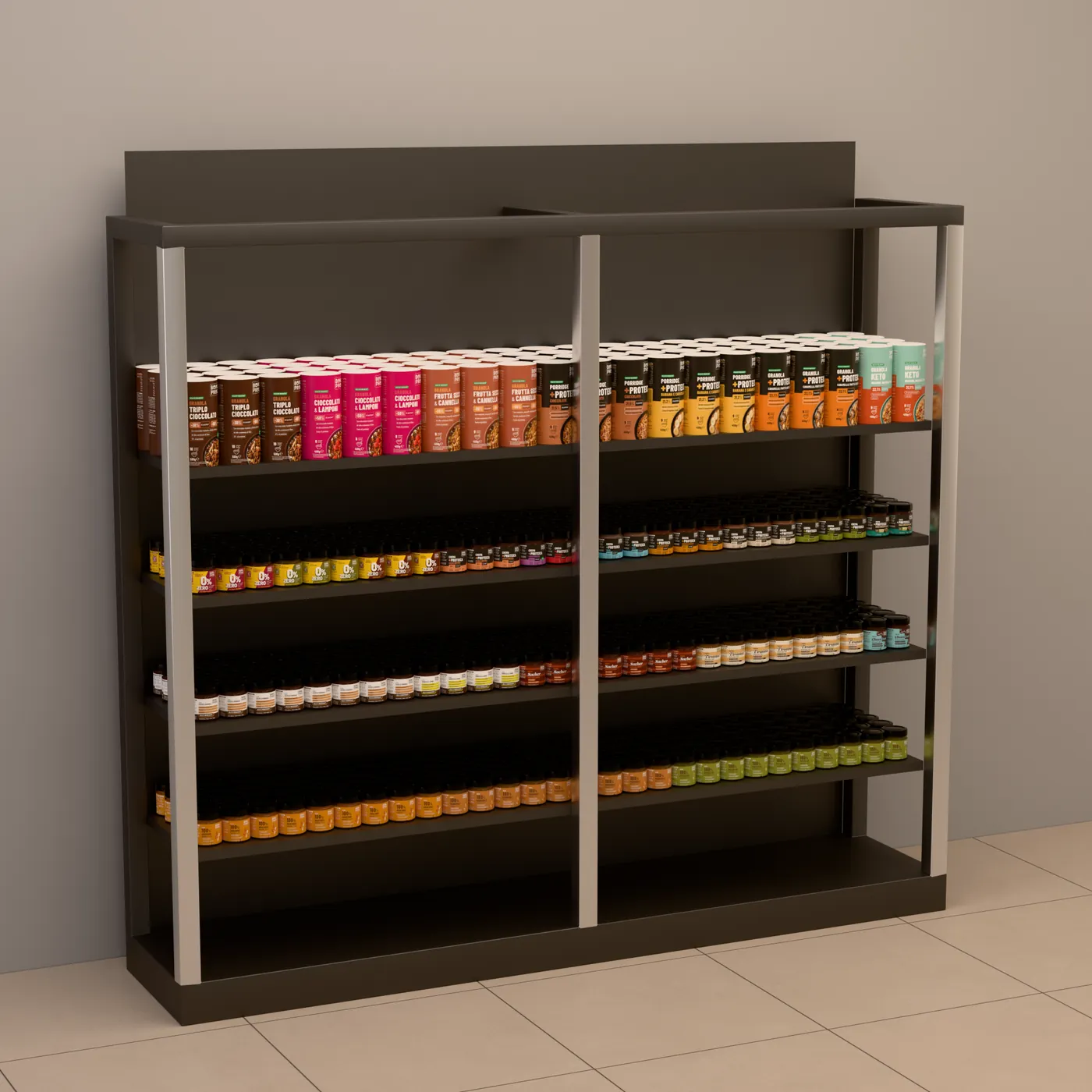
For buyer presentations I rebuilt the shelves in 3D from the planogram: decision makers see the real footprint of the products, not a spreadsheet.
Where the brand lands
- Conad
- Il Viaggiator Goloso
- Cortilia
- Foorban
- Millefarmacie
Every new channel got its own announcement: LinkedIn posts, crowners, point-of-sale material.
Offline too
The leaflet packed into thousands of boxes accompanies the unboxing and takes the brand experience off the screen.
A campaign a month
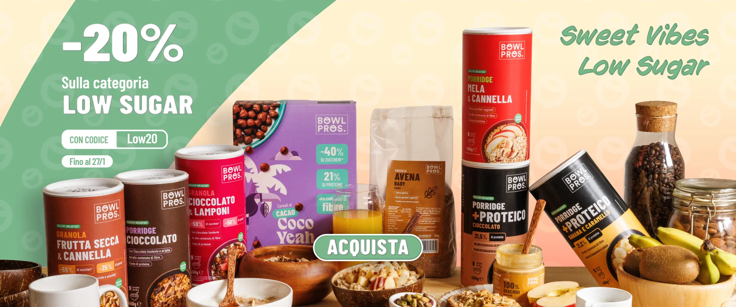
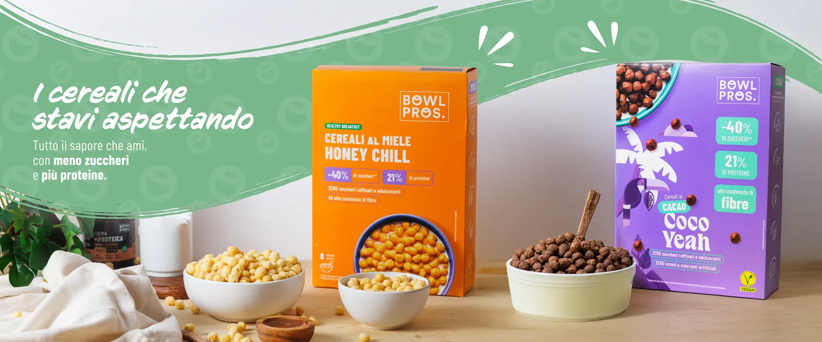
Autumn, Christmas, Easter, product launches, category deals: for each promo I made desktop and mobile hero banners, newsletters, stories and the animated version. The format changes every time, the message doesn’t.
Low Sugar · Dec 2025
Easter · animated banner
Honey Chill launch
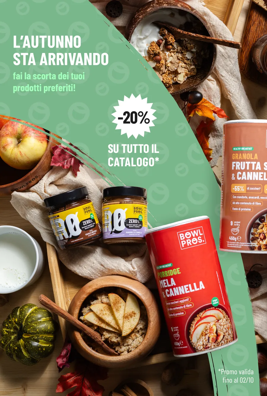
Autumn · mobile
Christmas · animated hero
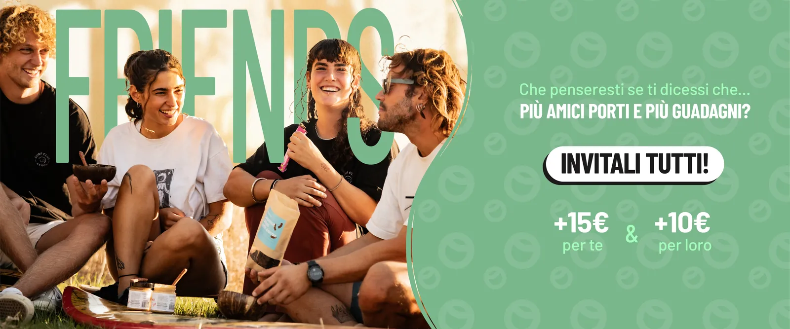
Refer a friend
First attempts
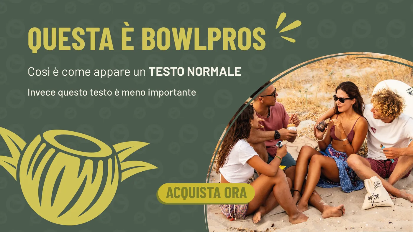
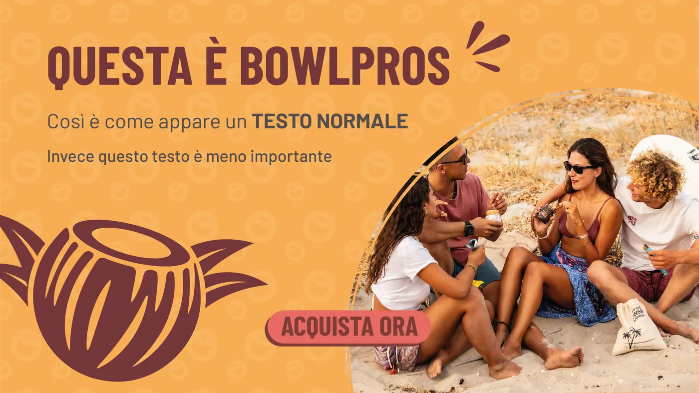
The first explorations date back to October 2025, in a study to extend the old guidelines: warmer colours, illustration, the bowl used as a frame.
From now on, the brand does the talking.
After ten months I knew every label, every banner, every shelf. I proposed a complete overhaul of the identity: logo, colours, type, shapes and photography, collected in 36 boards.
People first, colours second
The rebrand starts from three questions: what Bowlpros is, who it talks to, what character it has.
What Bowlpros is
- the heartQuality foodHealthy, indulgent, few ingredients. Breakfasts and snacks.
- the structureAuthorityQuality of service, knowledge of the field.
- the reachSharingRecipes, tips, food influencers.
- the edgeInnovationUnique flavours, distinctive packaging.
Who it talks to
The everyman
- Friendly, humble, genuine
- Wants to belong
- Is transparent and expects transparency
- Not a snob: knows everyone has their struggles
The worn-out
- Hectic life: wants to slow down
- Complicated life: wants to simplify
- Escapes on social media, looking for quick, good recipes
- Relies on experts
The archetype
Bowlpros is the friend next door who gets your problems and happens to be an expert in something you need.
Three colours instead of three categories
- Raspberry
#E31B56Creativity · passion · expression - Peach
#F3C9A1Calm · comfort · humanity - Chocolate
#3D3028Stability · security · permanence
How much of each colour
Raspberry never goes above 10%: it’s a strong colour, and too much of it throws everything off.
Green, grey and tiffany stay on the labels, but in communication they shrink to a bullet point: they flag the product type without taking over the layout.
- Healthy
#00B453 - Protein
#1D1C1C - Keto
#74BEAD
One typeface, two axes
I chose Mona Sans: as legible as the everyman needs, and able to change width and weight continuously to fit any space. It’s free on Google Fonts, so anyone working with the brand can use it.
Healthy, tasty breakfasts
Type to try it ↑
- The bigger the text, the narrower it gets. The smaller, the wider.
- Long copy in medium, with generous leading.
- Never raspberry on whole sentences or on the black weight.
The logo
The two bowl-shaped Os stay, the full stop goes, the strokes get fuller. The single-line version becomes the main one; the boxed version stays for packaging and the homepage.

Drag to compare
From mark to system
The starting point is the logo bowl seen from the front. Filled and sliced at three heights it becomes four shapes; stacked and mirrored they form a module, and the module repeated in offset columns is the brand pattern. The same shapes work as masks and frames.
From mark to system
The starting point is the logo bowl seen from the front. Filled and sliced at three heights it becomes four shapes; stacked and mirrored they form a module, and the module repeated in offset columns is the brand pattern. The same shapes work as masks and frames.
- 01Seen from the front
- 02Solid
- 03Sliced
- 04The module
- 05The pattern
Rules you can see
Every rule in the guidelines is shown on a real case. This is one of the new system’s heroes: tap the dots to read them.
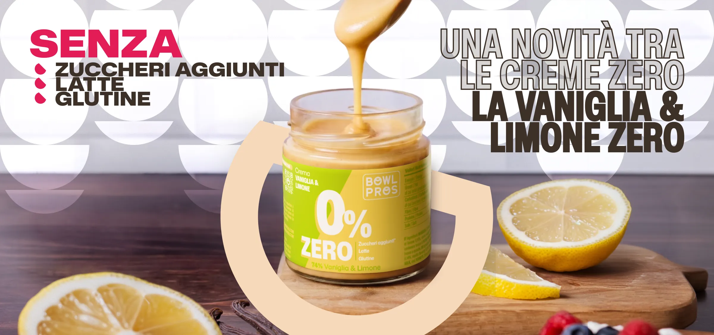
Only on the word that matters. The bullet drops echo the bowl shape.
Same shape, two uses
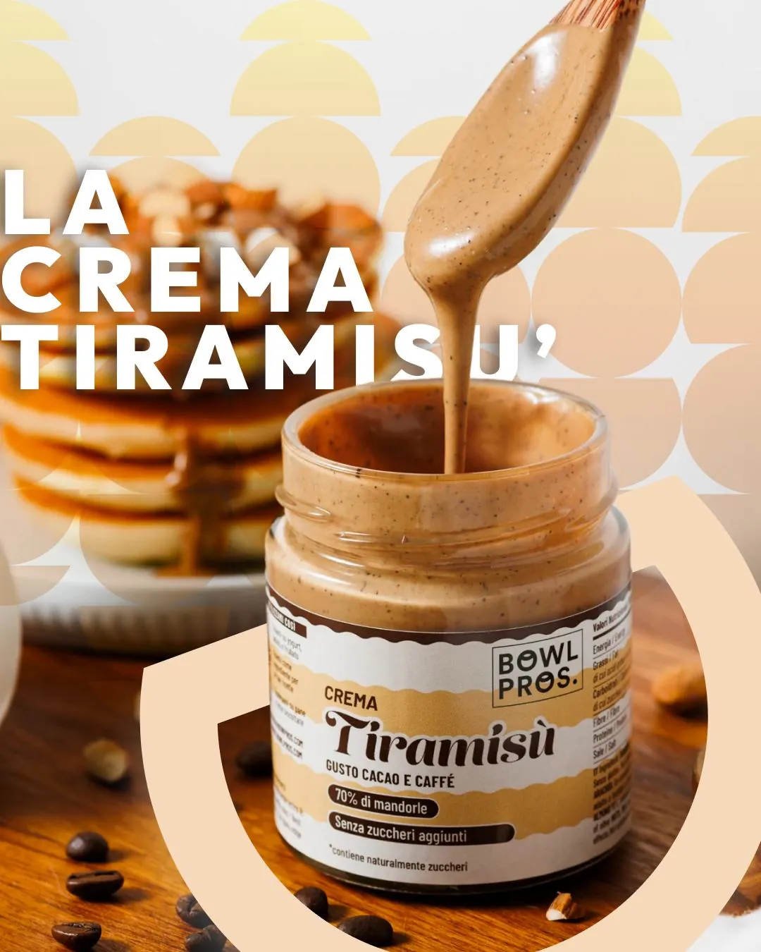
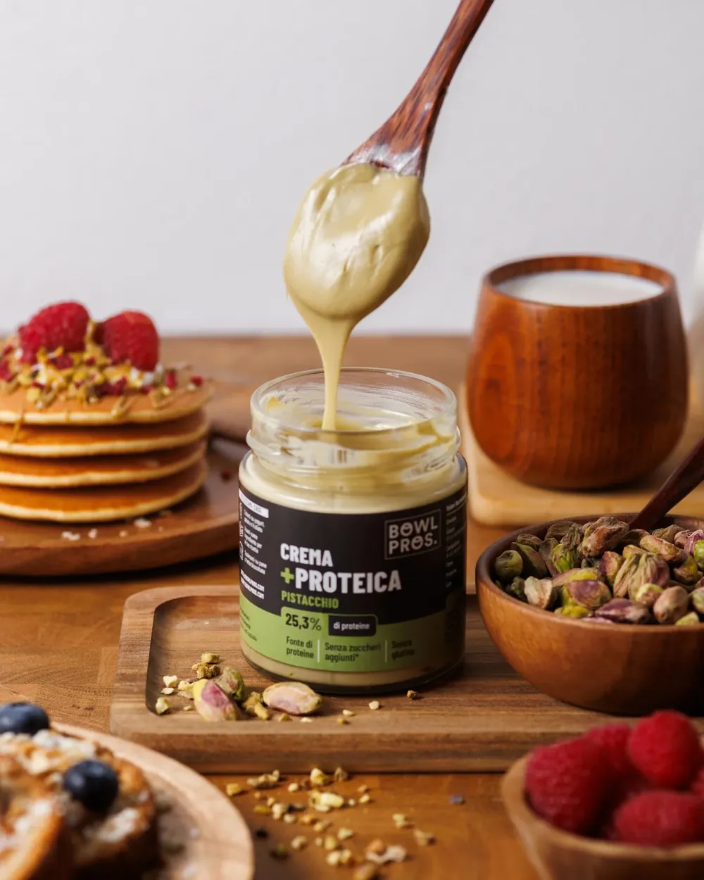
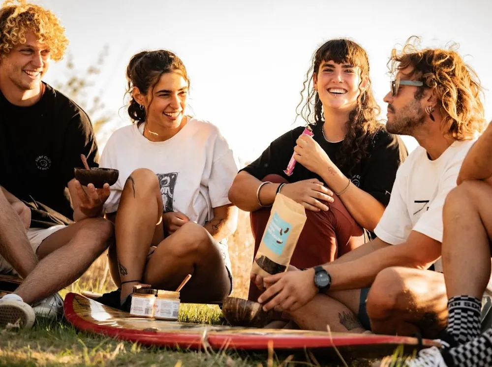
Photography: home, not studio
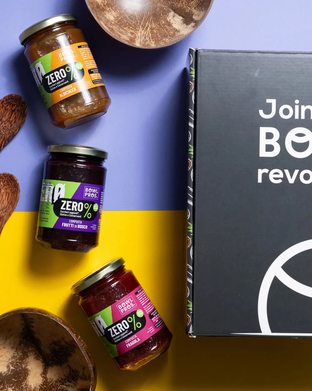
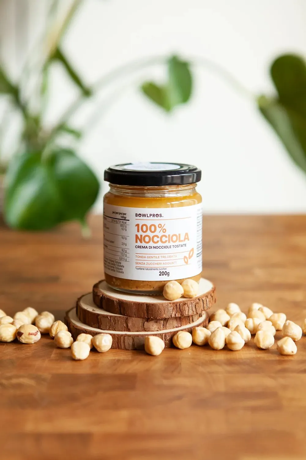
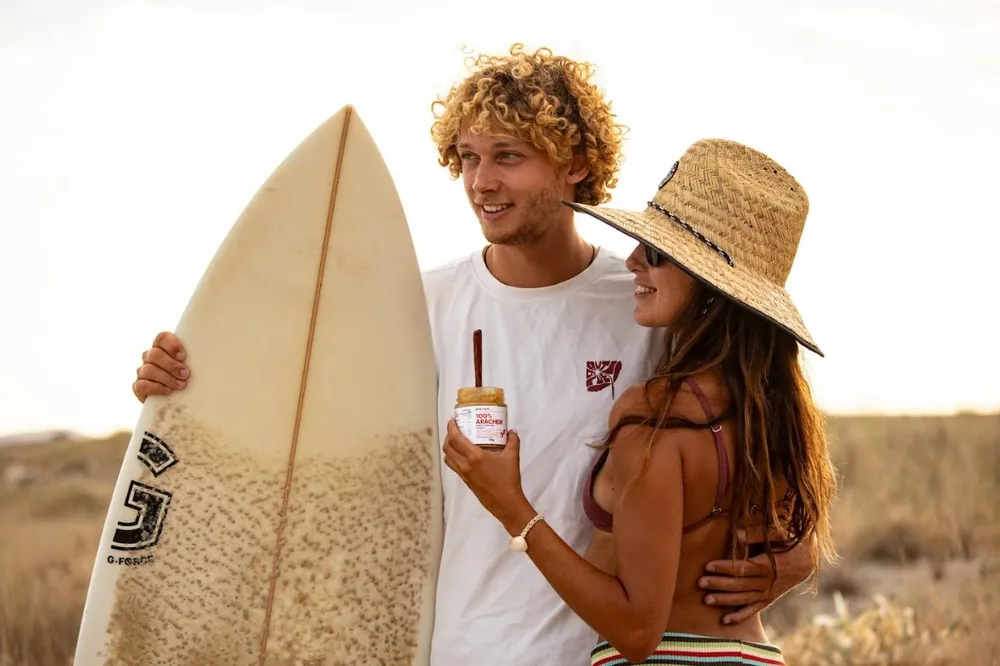
Bowlpros’ essence is a contrast: an everyday, friendly setting, and a product that wants to feel magical, with pop-coloured labels.
Yes
No longer
Same brand, after
Since May 2026 every new piece starts from the guidelines. Some projects came back to my desk twice, before and after: the comparison says more than any explanation.
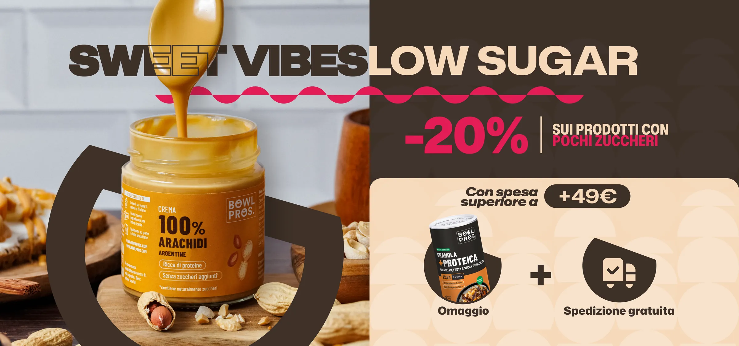
Sweet Vibes Low Sugar
The same promo, nine months apart.
The Bowl Box leaflet
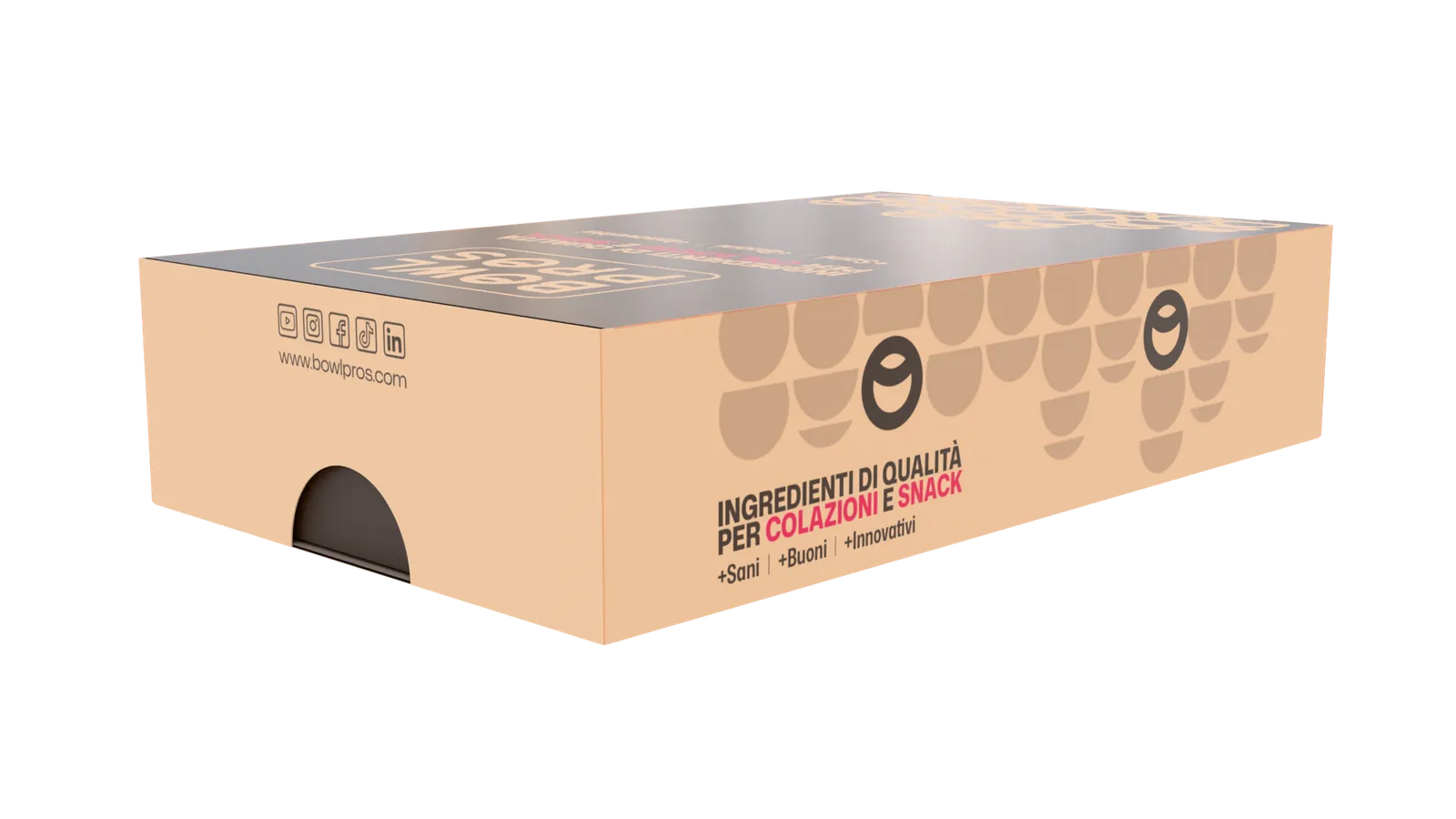
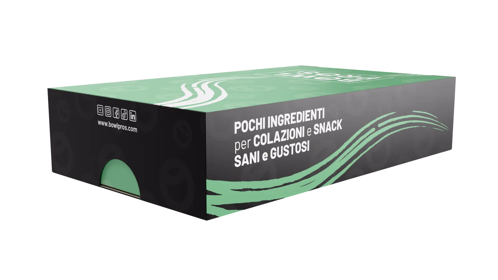
Same format as the 2025 leaflet, contents rethought with the new system: bowl shapes as frames, peach and chocolate, the loyalty programme instead of the referral code.
Displays
The same floor display, same 3D camera: on the left the 2025 artwork, on the right the rebrand.
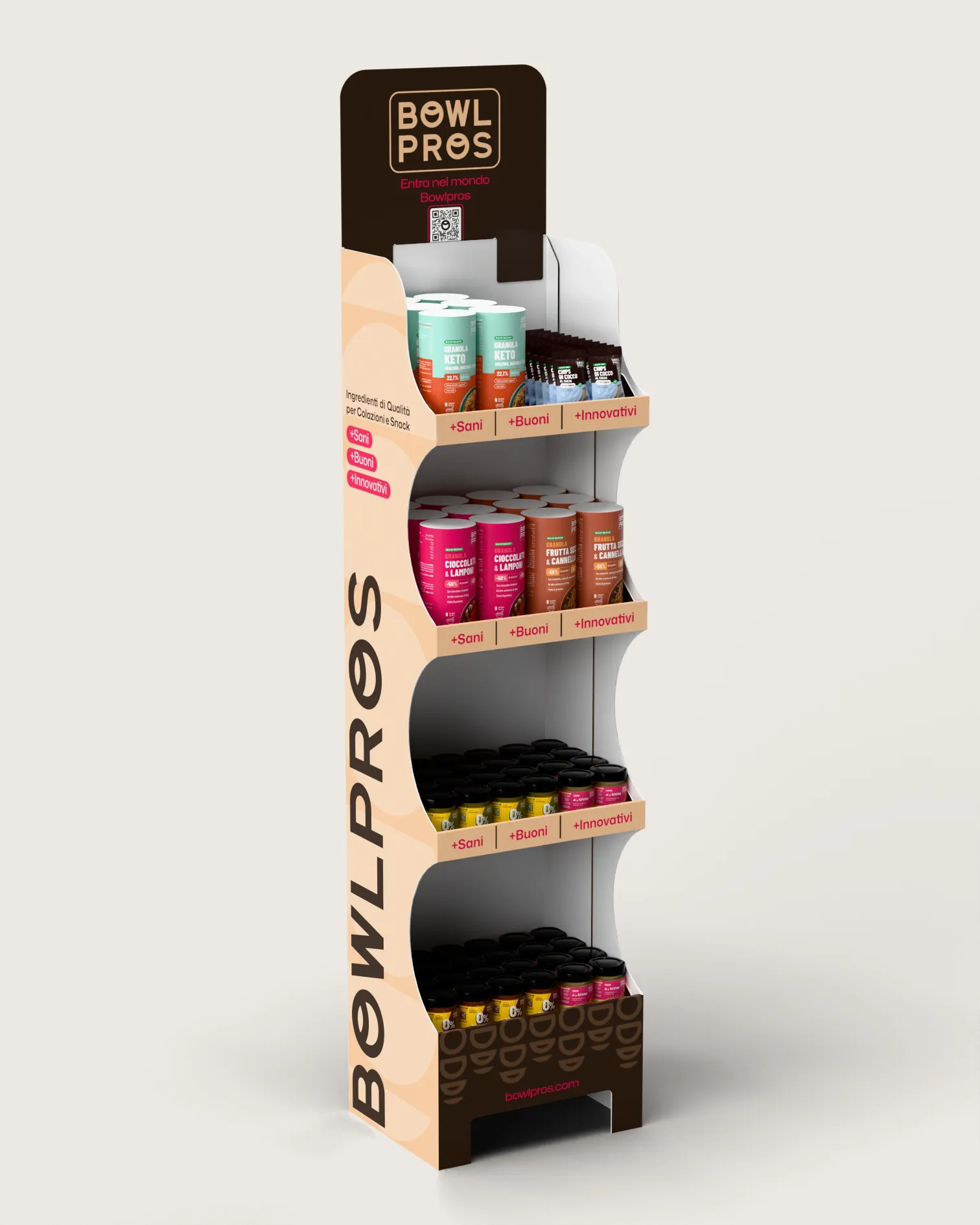
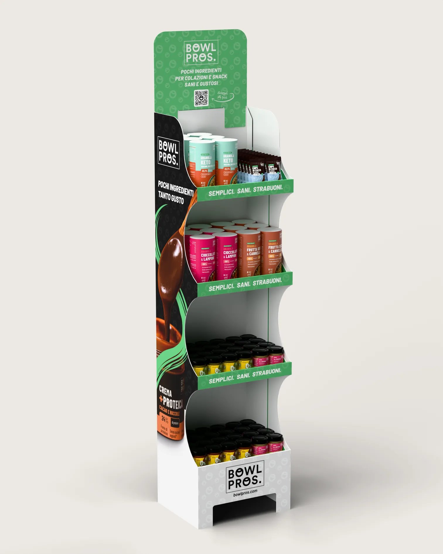
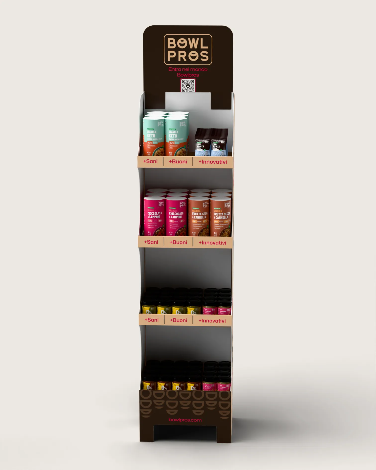
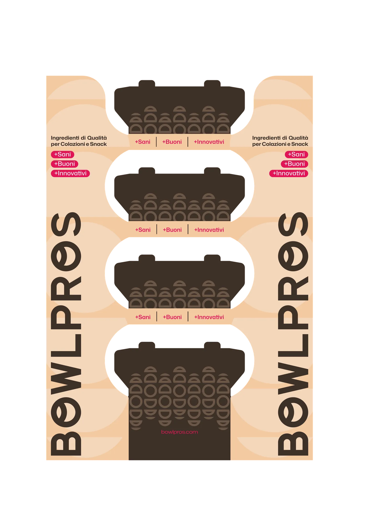
The counter display for the bars: the bowl pattern replaces the green waves, chocolate takes the place of black.
The system in motion
The rebrand’s shapes were born to move: the bowl opens, tilts, becomes a ring, reveals the product.
Social and site
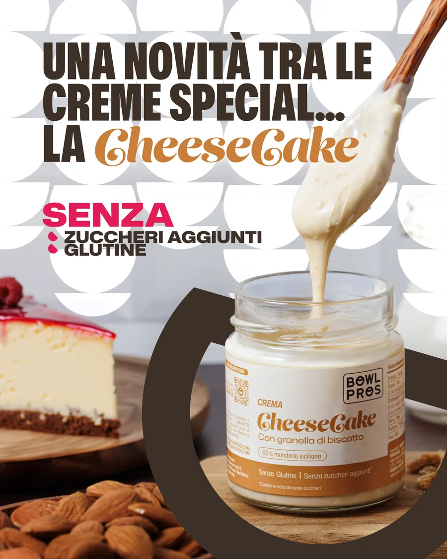
Cheesecake launch
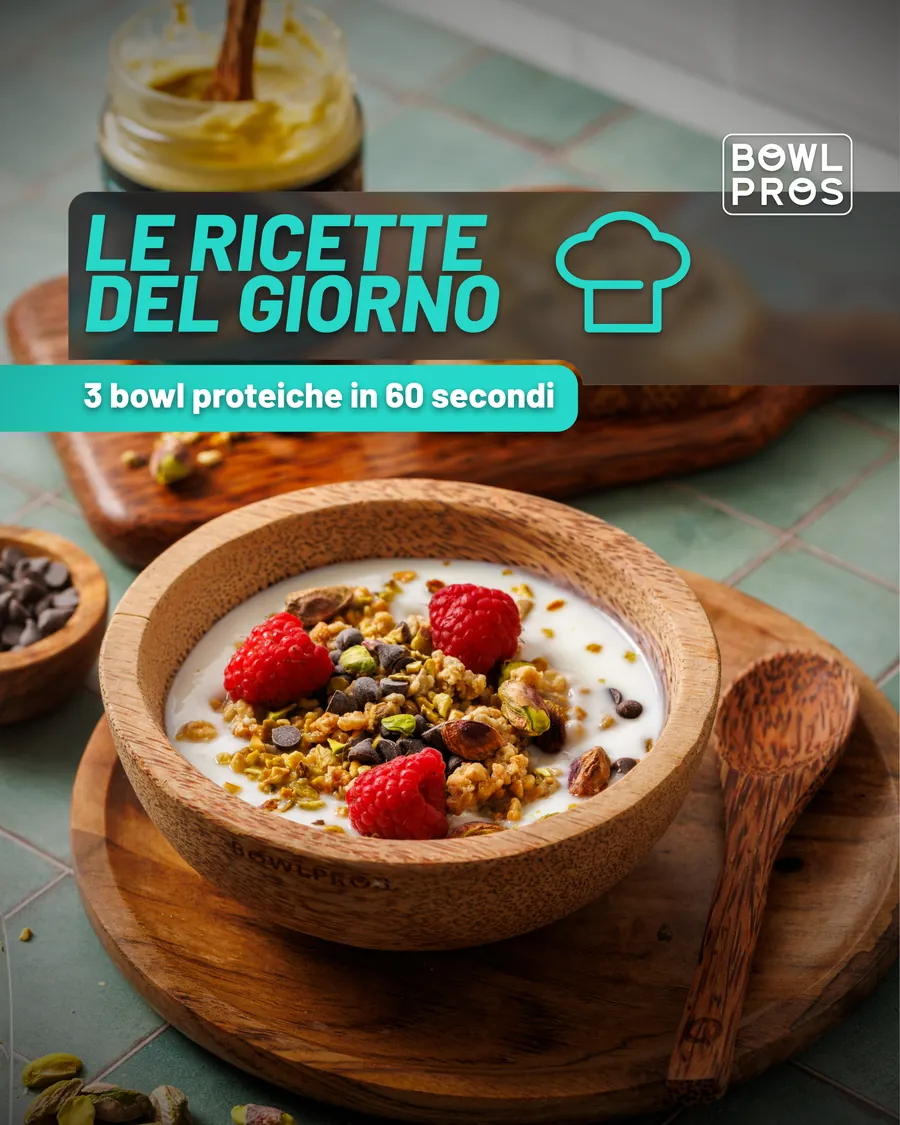
Recipe of the day
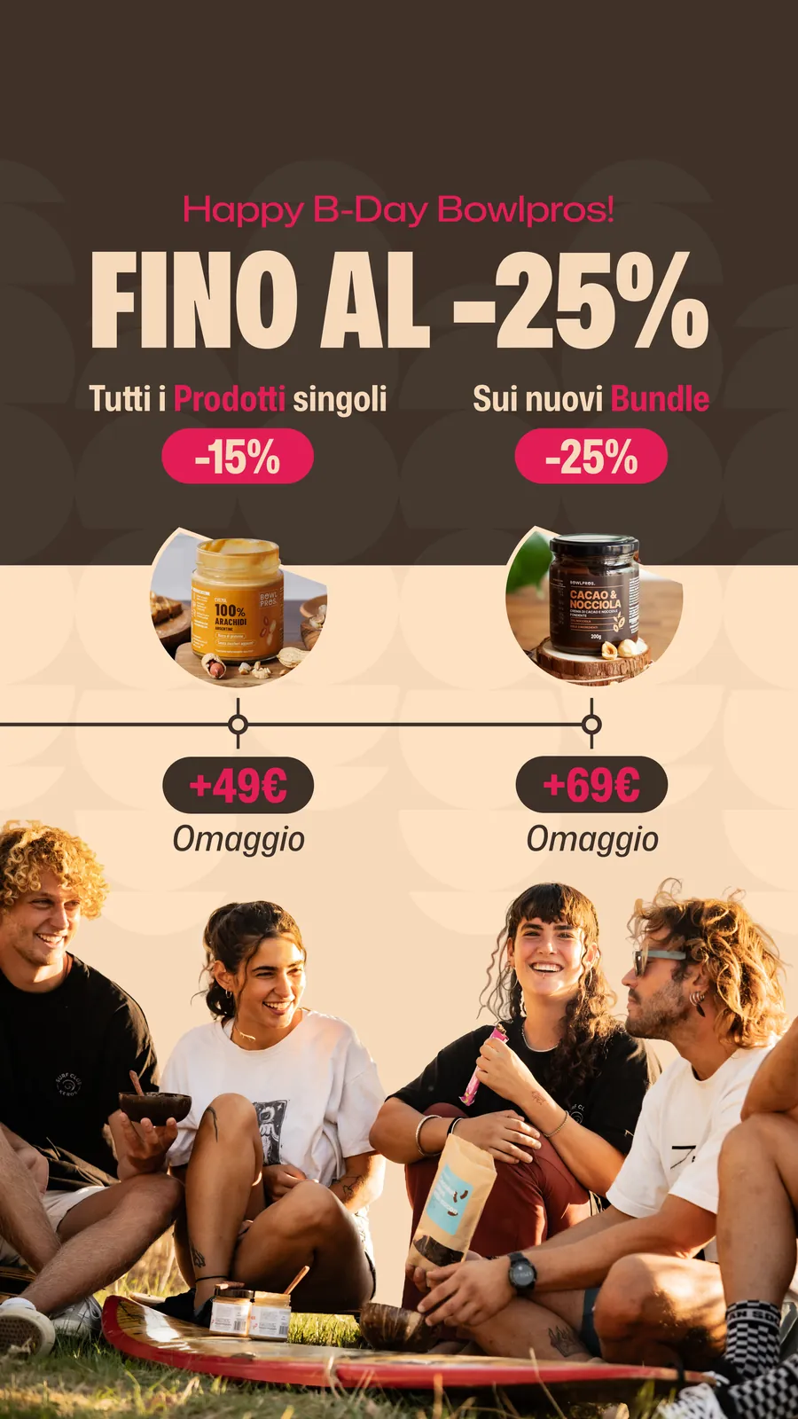
Bowlpros birthday · story
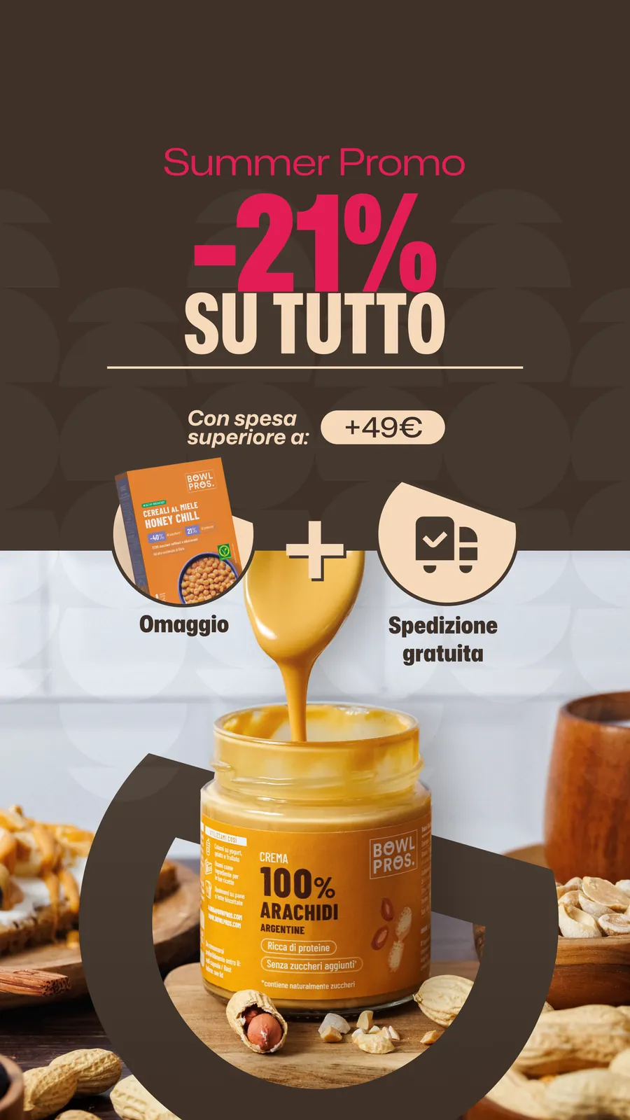
Summer Sales · story
Icons
Plain and essential, readable by anyone: the site’s sections in six marks.
 New
 Food
 Recipes
 Community
 Accessories
 Events
What stays
Today Bowlpros banners, labels and displays all start from the same 36 boards. For me it was the step from executing to writing the rules: understanding a brand from the inside, questioning it, and leaving a tool that works even when I’m not the one using it.
In this project
- Brand identity and guidelines
- Packaging and print-ready artwork
- Trade marketing and retail
- Hero banners and campaigns
- Motion graphics
- 3D mockups and shelves