%20rotate(-45)'/%3e%3cpath%20class='cls-1'%20d='M96.14,33.17c-3.35-1.35-7.06,1.83-7.21,5.13-.19,2.04,1.2,4.14,2.91,6.01,2.04,2.25,4.4,4.48,5.7,7.24,2.36,4.82,1.48,10.81-2.26,15.12-2.04,2.39-4.92,4.15-7.97,4.78-2.86.65-5.81-.02-8.4,1.48-2.26,1.27-4.31,3.65-6.46,5.79-2.5,2.54-4.02,4.72-3.57,7.25.39,2.58,2.6,4.84,5.23,5.08,4.64.16,7.27-4.77,10.88-7.2,1.42-1.07,2.94-1.86,4.65-2.34,3.79-1.1,7.98-.23,11.25,1.97,1.18.78,2.24,1.58,3.15,2,2.09,1.09,3.29-.66,4.03-2.5,6.19-15.07,2.91-34.6-7.91-46.75-1.08-1.23-2.4-2.44-3.88-3.02l-.16-.06.02.02Z'/%3e%3cpath%20class='cls-1'%20d='M41.93,97.93c5.85-6.95-5.61-11.73-7.4-17.99-2.58-6.48.75-14.24,6.87-17.47,3.73-2.45,8.37-.97,12.2-2.9,2.15-1.22,4.02-3.36,5.81-5.13,2.46-2.5,4.29-4.49,4.27-6.87.08-4.02-4.48-7.66-8.24-5.52-2.82,1.45-5.18,4.61-7.94,6.6-6.37,4.79-13.03,2.87-18.83-1.54-2.52-1.49-3.78,1.02-4.55,3.11-2.67,7.12-3.53,15.57-2.25,23.43.49,7.08,11.03,32.4,19.93,24.42l.13-.13h0Z'/%3e%3cpath%20class='cls-1'%20d='M34.5,41.91c6.88,5.83,11.77-5.41,17.89-7.32,6.5-2.7,14.38.62,17.64,6.8,2.44,3.73.97,8.37,2.9,12.2,1.22,2.15,3.36,4.02,5.13,5.81,2.5,2.46,4.49,4.3,6.87,4.27,4.1.08,7.73-4.63,5.44-8.4-1.53-2.81-4.68-5.18-6.63-7.93-4.69-6.36-2.68-12.86,1.63-18.64,1.52-2.56-.97-3.81-3.09-4.59-7.11-2.67-15.57-3.53-23.43-2.25-7.11.5-32.26,10.96-24.49,19.91l.12.12.02.02Z'/%3e%3cpath%20class='cls-1'%20d='M97.93,90.57c-6.95-5.85-11.73,5.61-17.99,7.4-6.31,2.54-14.02-.65-17.31-6.52-2.62-3.81-1.1-8.59-3.06-12.54-1.21-2.16-3.36-4.03-5.13-5.82-2.73-2.7-4.86-4.6-7.53-4.24-5.52.89-7.32,6.64-3.09,10.75,2.34,2.64,5.08,5.01,6.46,8.12,2.76,5.84.3,11.3-3.16,16.06-1.52,2.56.96,3.81,3.08,4.59,7.12,2.67,15.57,3.53,23.44,2.25,7.08-.49,32.4-11.03,24.42-19.93l-.13-.13h0Z'/%3e%3c/svg%3e)
Banco delle Opere di Carità
2025 Social ReportBanco delle Opere di Carità recovers food and goods that would otherwise go to waste and delivers them, through 45 local organisations, to more than 6,100 people in Piedmont. For its social report I took the arc in the logo and made it the shape of every page.
- “Bilancio Sociale” in thin letters, the year in a heavy italic, and below it the donation box: what the Banco collects and delivers.
- The light blue ground wraps around the volume: front, spine and back are a single colour.
- The logo’s arc enlarged until it leaves the page, with “dal 1993”: the same shape that opens every chapter.
One arc for a hundred pages
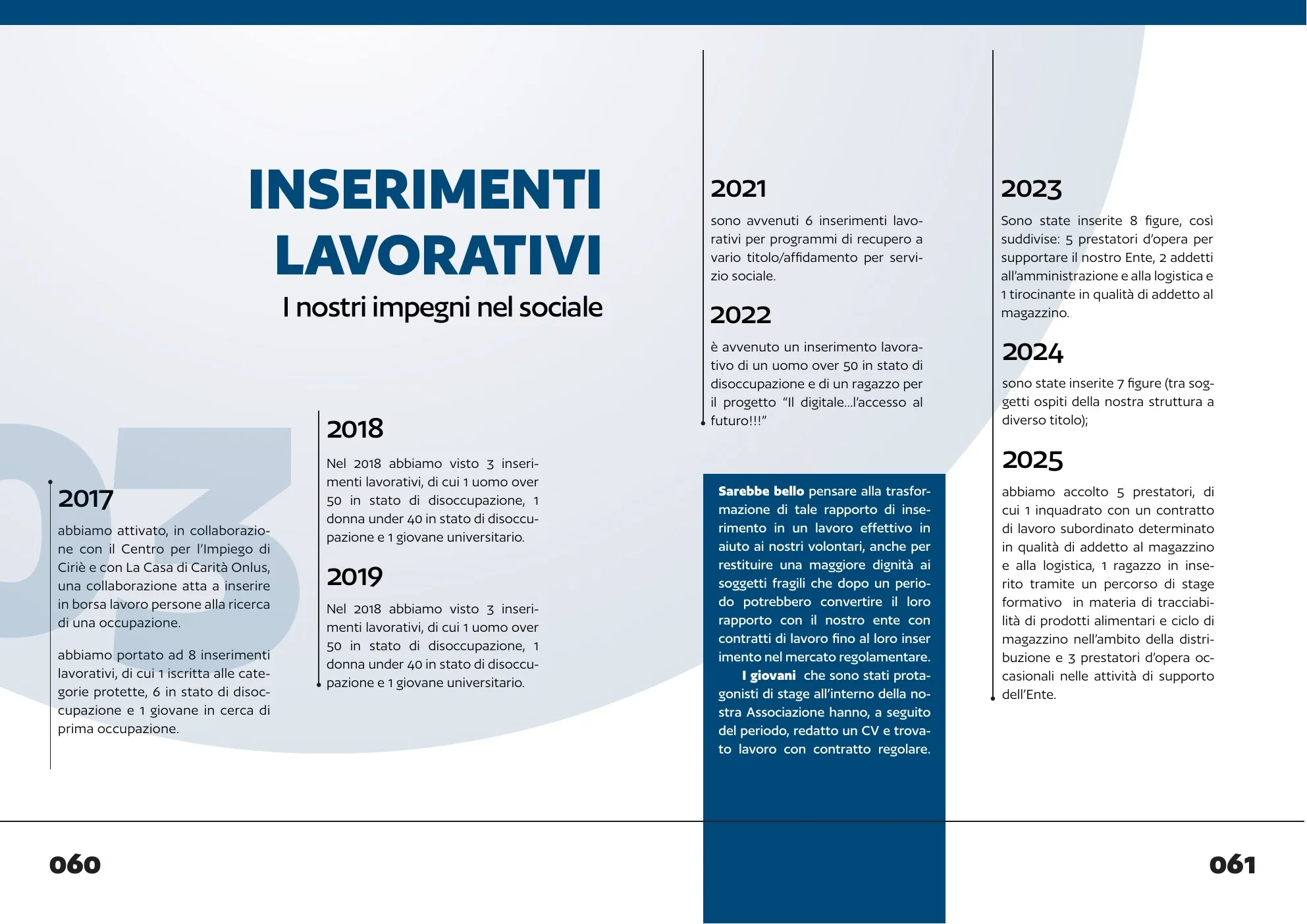
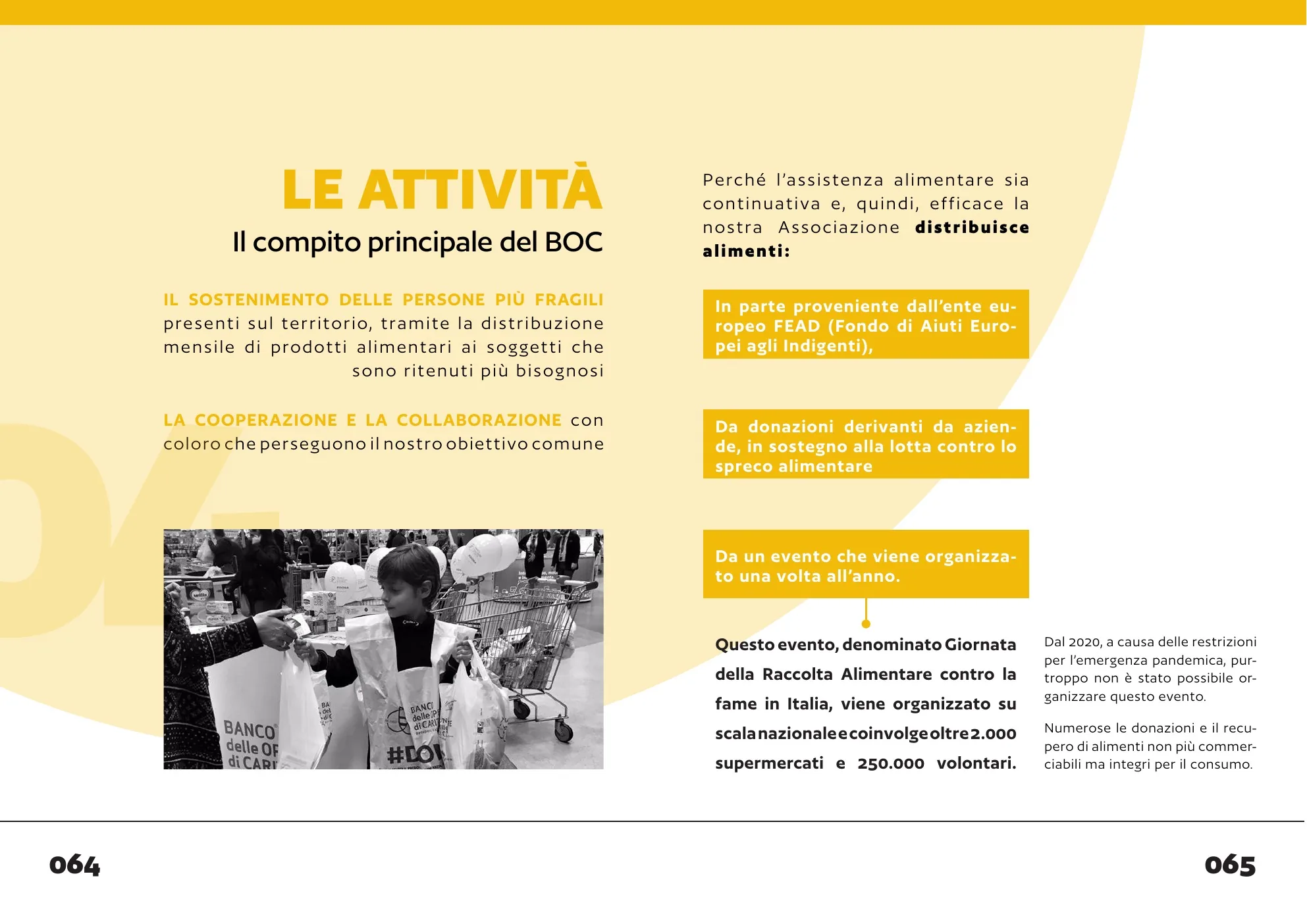
The Banco’s logo is a banded arc. In the report it becomes the background of every page: a large pale circle entering from the edge, with the chapter number huge and cropped, like a watermark.
On top, a plain grid: ragged title, vertical rule, text in two columns. The shape changes scale and colour, the structure stays.
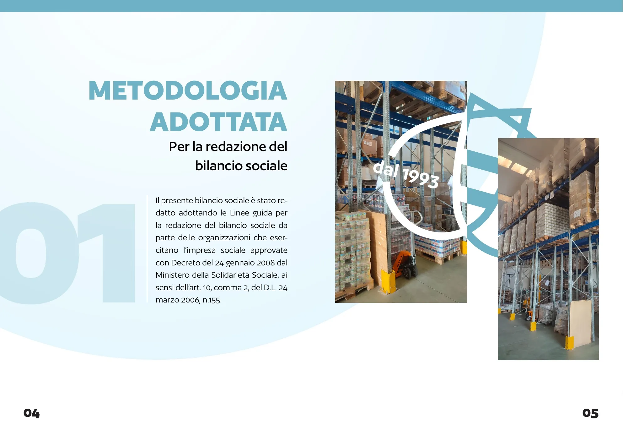
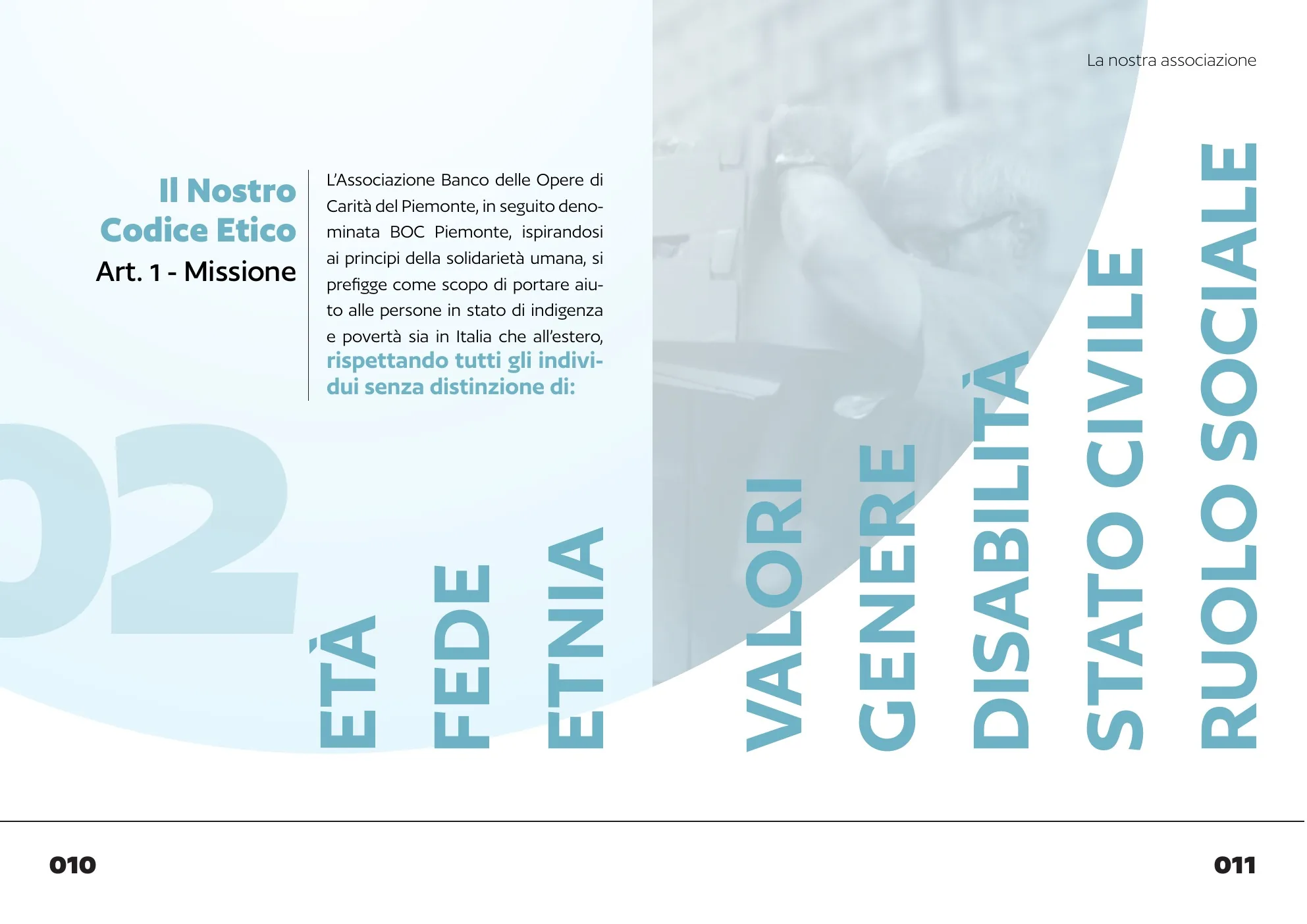
In 2025 the Banco moved 286,637 kg of goods, for 45 partner organisations and more than 6,100 people. The numbers had to land before the text.
Data at a glance
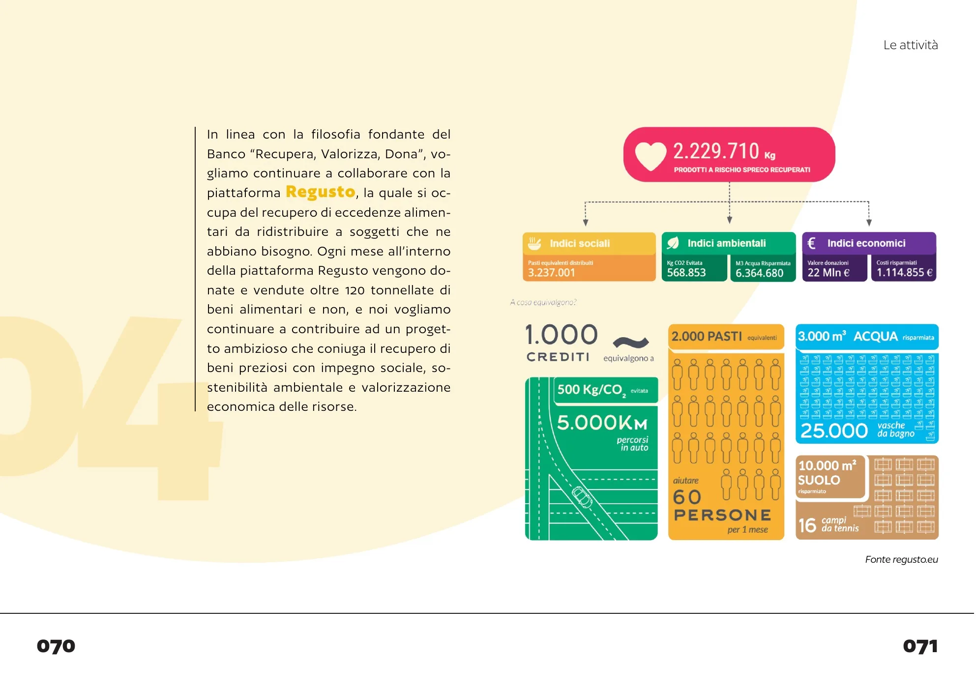
The data from Regusto, the platform that recovers surpluses, become blocks of colour: 2,229,710 kg saved from waste translated into meals, water, CO₂, land. Each block has its icon and its unit, and reads on its own.
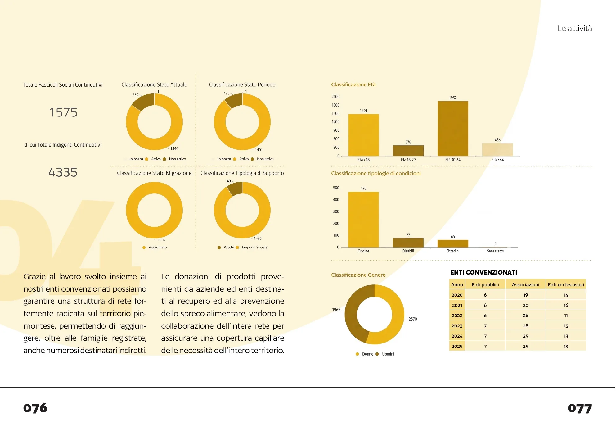
Three colours to find your way
The association in light blue, work placements in midnight blue, activities in yellow, the future in blue. The bar at the top of the page always says which chapter you are in.
Eight chapters, one shape
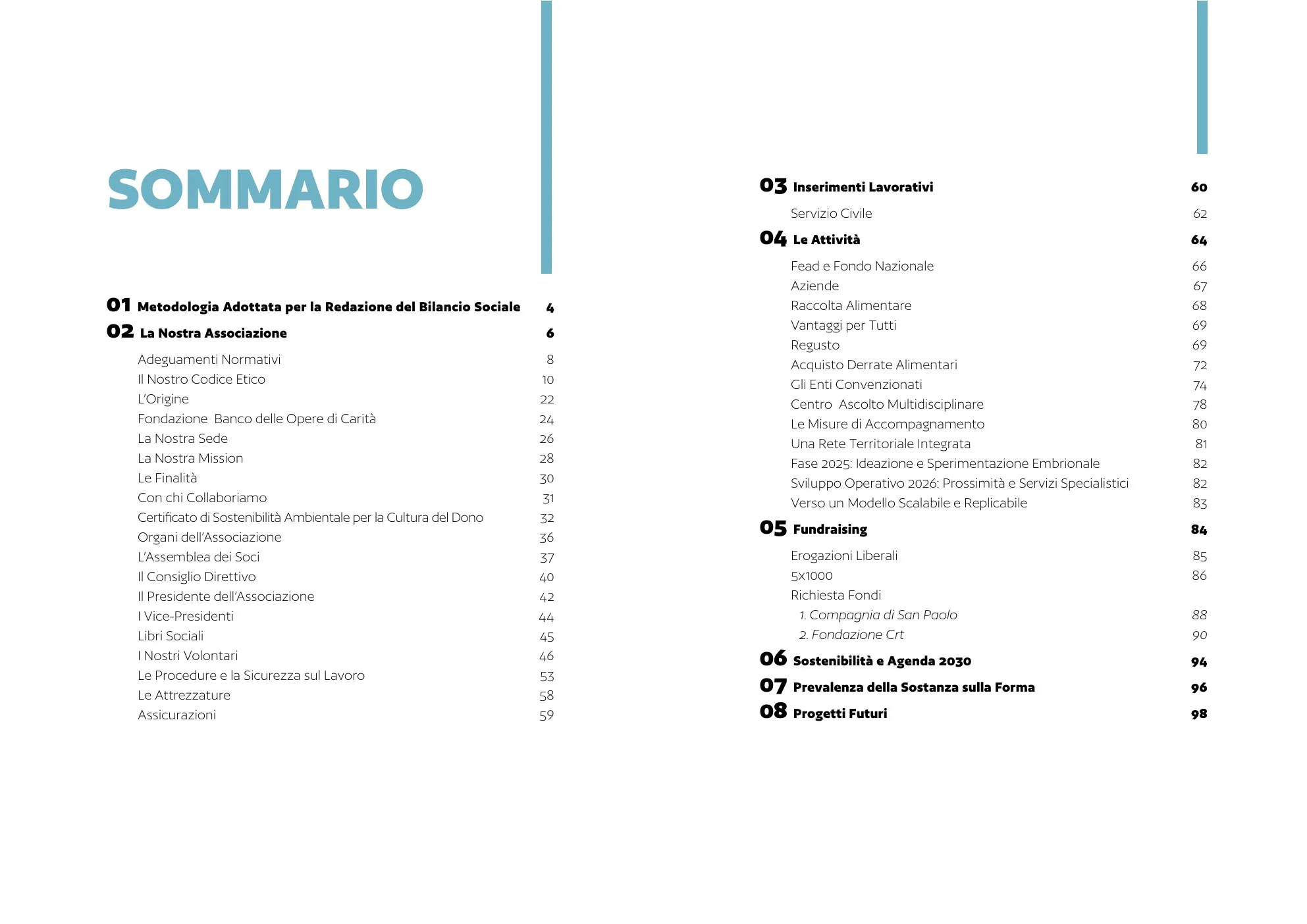
From the methodology to future projects: the arc changes colour with the chapter and readers always know where they are.
Drag, use the arrows or tap the ribbon to browse.
- Client
- Banco delle Opere di Carità Piemonte ETS, Caselle Torinese
- My work
- Editorial design, layout of 104 pages, infographics and tables, cover, A4 and A5 print files
- Tools
- InDesign, Illustrator, Photoshop